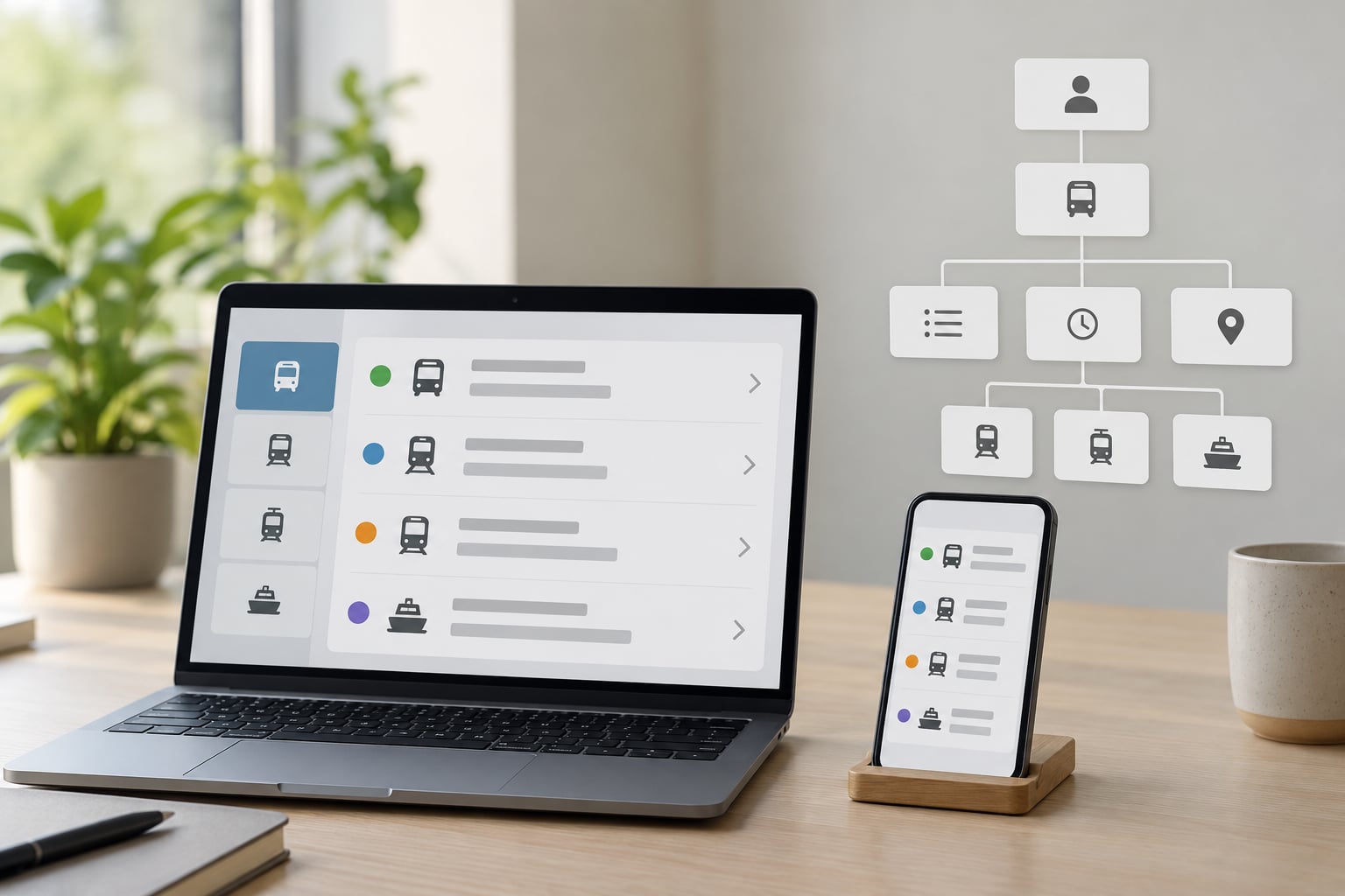
A screen reader reads your app’s accessibility tree, not your pixels. That is how screen readers interpret your app: the operating system builds a tree of every control, view and text run, gives each one a name, a role, a state and sometimes a value, then speaks those nodes out loud one at a time as the user swipes through them. Everything below follows from that one fact.
That matters for civic and public-service apps especially. Someone planning a bus route in a transit app, checking a sensor alert, or reading an open-data table at 7am on a cracked phone is not making an unusual request, and the only thing your team controls is what the screen reader can say.
Predict that output and the problems become things you fix in code, not things you discover in a bug report.
Table of Contents
- How Screen Readers Read Your App: the Tree, Not the Screen
- What Screen Readers Use to Build the Accessibility Tree
- The Main Parts of a Screen-Reader Announcement
- Order of the pieces differs by platform
- How Accessible Names Affect Spoken Output
- Semantic Structure Lets Screen Readers Skip Around
- How to Test What Screen Readers Interpret
- How screen readers interpret your app differently on iOS and Android
- Screen Reader Testing Checklist for Civic Apps
- Common Reasons Screen Readers Give an Unclear Announcement
- What Changes When You Fix Accessibility Semantics
- Frequently Asked Questions
- What does a screen reader actually interpret in an app?
- Why does my screen reader announce the wrong label?
- Should I test my app with VoiceOver, TalkBack, or both?
- Can an accessibility tree show what a screen reader will say?
- Do automated accessibility tools replace manual screen-reader testing?
- Conclusion
How Screen Readers Read Your App: the Tree, Not the Screen
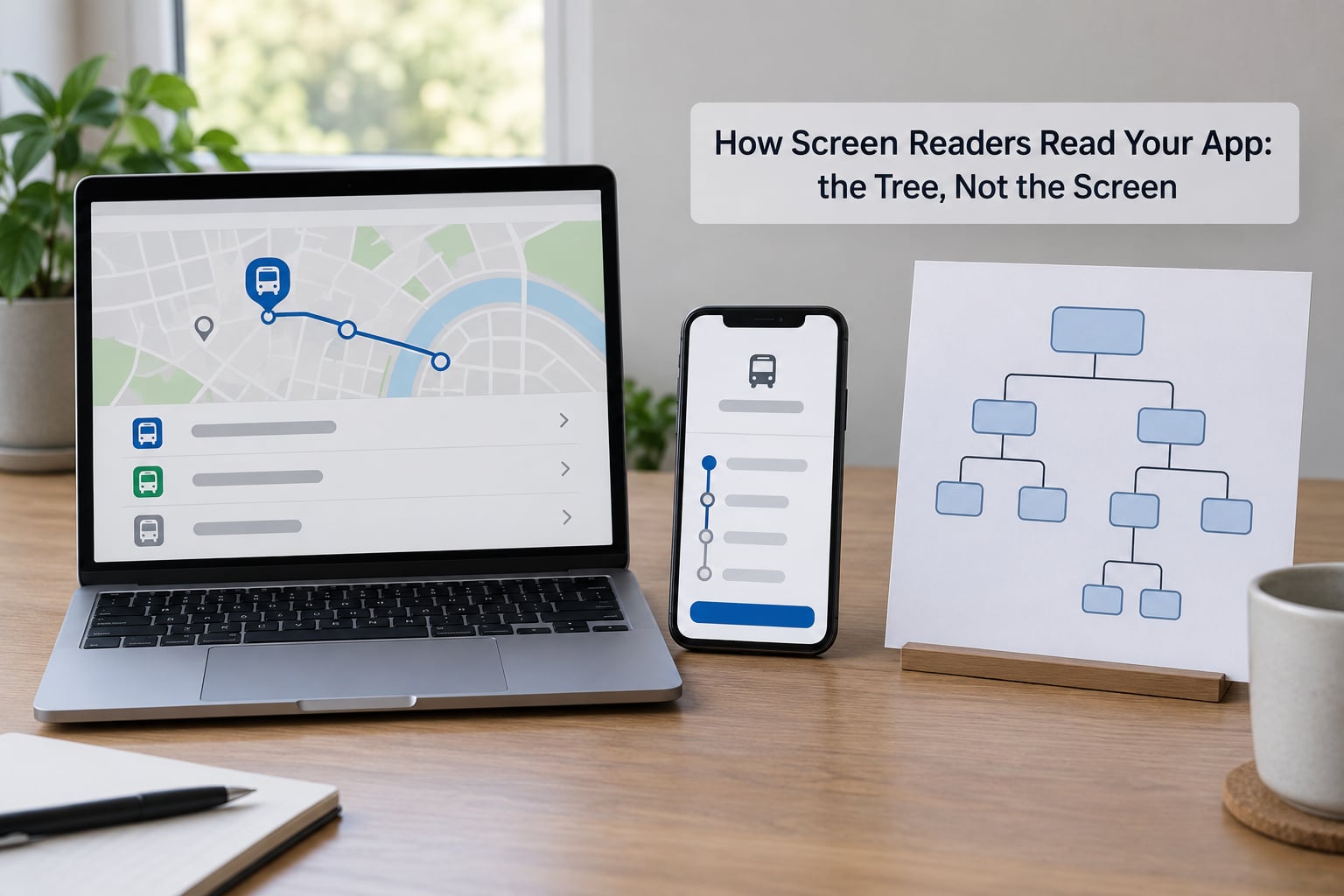
Three different layers are involved, and mixing them up is why developers get surprised.
The first is what a sighted person sees: the pixels, the layout, the reading order that the eye follows across columns and cards. The second is the accessibility tree: a machine-readable copy of the interface that the OS maintains in parallel. The third is the spoken output, which is the accessibility tree run through a speech synthesiser, filtered by whatever the user chose to hear.
A control can look obvious and be a mystery. A circular icon button in the corner of a map screen looks perfectly usable; if nothing on it describes what it does, the screen reader has a role and no name, and it announces “button”. Users then have to swipe on and try things at random, which people who use screen readers all day call tap-and-pray.
The reverse also happens. A container with three lines of text inside it can be announced as one long string if you told the OS the whole thing is a single element, and a user who wanted the third line has no way to get there.
What Screen Readers Use to Build the Accessibility Tree
The tree is built from what your framework reports to the platform, and what it reports depends on the platform.
On iOS, UIKit and SwiftUI expose each view as an accessibility element or not, plus a label, a value, a hint and traits such as button, header or selected. If you build your own view with draw(_:) and never set an accessibility element, nothing reaches the tree. On Android, the accessibility framework reads each view’s node info: contentDescription, text, class name, clickable flag, state description and, for grouping, a description that points at siblings.
Cross-platform frameworks sit on top of that. React Native exposes accessible, accessibilityLabel, accessibilityRole, accessibilityState, accessibilityHint, accessibilityValue, accessibilityLiveRegion, importantForAccessibility, accessibilityViewIsModal and accessibilityElementsHidden, then maps them to iOS or Android equivalents. Flutter uses a Semantics widget with label, value, hint, button, header and container flags, plus a semantics tree flag you can dump at runtime.
On the web the same idea runs on the DOM and ARIA, and Chrome on desktop, Edge, NVDA, JAWS or VoiceOver on macOS all consume it. The one warning that applies everywhere: the platforms do not expose identical information, so a control that announces cleanly on one can be silent or differently worded on the other.
The Main Parts of a Screen-Reader Announcement
Every announcement is assembled from the same handful of pieces, and you can point at which piece came from where in your code.
Role is the control type: button, link, heading level two, text field, tab, switch, adjustable. Accessible name is the label text. Value is the current data: “2 of 5”, “17 degrees”, “Flat fare”. State is what is true right now: selected, expanded, disabled, busy, checked. Position gives you “3 of 12” in a list or a heading level. Hint is the optional line of instructions after a pause.
Here is what a route-planning screen sounds like once that work is done. VoiceOver says “Plan a trip, button”. TalkBack says “Plan a trip, button” too, and then, if the control is selected inside a segmented mode switch, adds “selected”. A fare selector with a value set announces as “Fare type, Off peak single, 1 of 3”. An icon-only map control that got a proper label announces as “Recenter map, button” instead of “button”.
The useful discipline is to expect all of these words to exist and then check that each one is there. A screen reader user navigating by list, say, is asking a very specific question: how many stops are on this list, which one am I on, and is it the one I wanted.
Order of the pieces differs by platform
VoiceOver tends to put value and state immediately after the name, then the hint last. TalkBack commonly reads name, role, then any additional text, and its hint behaviour depends on the verbosity level the user picked. Neither is wrong. Both are stable enough that users have learned them, which is why changing your phrasing is a bigger cost than changing your ordering assumptions.
How Accessible Names Affect Spoken Output
Accessible names come from several places, in a priority order that both platforms follow roughly the same way: an explicit label you set in code, then a programmatic relationship such as a label-for attribute or a labelled-by reference, then the visible text inside the control, then a content description, and finally placeholder or title text as a last resort.
That priority is why visible text and spoken text drift apart. If you set an explicit label, the visible caption is ignored for speech. If a container swallows its children, the child’s text is never read separately. And a label that repeats the role makes every announcement longer without adding anything: “Search button” spoken as “Search, search button” is padding, not clarity.
Three real examples from a typical booking screen. Weak: a magnifier icon labelled “icon”, announced as “icon, button”. Adequate: labelled “Search departures”, announced as “Search departures, button”. Misleading: an arrow labelled “Continue” that actually opens a modal, announced as “Continue, button” and then dumping the user somewhere they did not choose.
The mislabelled case is worse than no label at all, because a screen reader user may commit to it without exploring. A quick usability session with experienced testers at a city services meet will catch wording like this faster than any checker.
Semantic Structure Lets Screen Readers Skip Around
Structure is what lets people stop reading top to bottom. On the web and in native apps, screen readers can jump by heading, by landmark region, by link, by form control or by list, using a rotor on iOS and reading controls on TalkBack. Those shortcuts only exist if the interface declares headings, groups and lists honestly.
Take a journey-planning screen. If the whole page is one flat run of text and buttons, the user hears every departure card in order to reach the fare options, which on a live departures list is minutes of speech. If the screen has a heading for the search panel, a labelled group for origin and destination, a proper list for results and a heading before the fare section, the user can go straight to fares.
Two failures cause most of the trouble. The first is heading levels chosen by font size rather than document order, so the structure says everything is level two and the skip commands go nowhere. The second is grouping done too aggressively: wrapping a card in a single accessible element makes it one node, and on both major platforms the inner buttons become unreachable by swipe.
People who rely on screen readers often navigate almost entirely by headings, landmarks and links, so a clear visible caption frequently beats a clever programmatic announcement. Test your labels on sighted colleagues first, then check the tree.
How to Test What Screen Readers Interpret
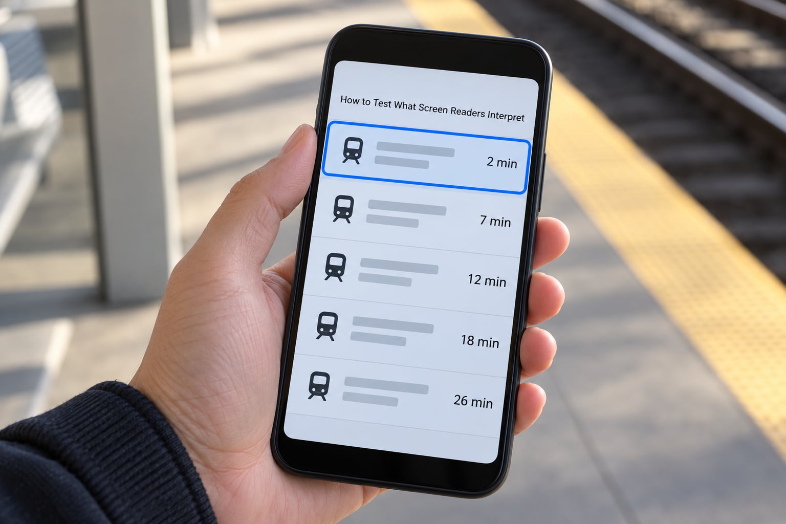
A usable pass takes about fifteen minutes per screen once you know the gestures. Do it on a real device, because emulators and simulators miss the gesture layer that matters most.
On iPhone or iPad, turn VoiceOver on in Settings, Accessibility, VoiceOver. Swipe rightward or leftward to move between elements, double tap to activate, three-finger swipe up or down to scroll, and use the rotor (two-finger rotate) to switch between headings, links and form controls. Turn on the three-finger shortcut in Settings, Accessibility, Accessibility Shortcut if you want a fast toggle.
On Android, install Accessibility Scanner from the Play Store, then enable TalkBack in Settings, Accessibility, TalkBack. Swipe rightward or leftward to move focus, double tap to activate, and swipe up then right for the local context menu. The volume keys shortcut toggles TalkBack without going into Settings on current Android versions.
On the web, run NVDA or JAWS on Windows with Chrome or Edge, or VoiceOver on macOS with Command+F5 to start. Worth knowing: the Read Aloud feature in a browser reads page text only, while VoiceOver or TalkBack reads every control. A colleague who says “my screen reader only reads the text and not the buttons” has hit the distinction that confuses most developers.
Inspect the tree rather than guessing. Xcode’s Accessibility Inspector (Xcode, Open Developer Tool, Accessibility Inspector) shows every element’s label, traits, frame and parent, and its audit runs checks over a live screen. Android Studio’s Layout Inspector and Accessibility Scanner cover the same ground on Android, and accessibility-focused libraries let you dump a whole accessibility tree from a React Native or Flutter debug session.
Record what you hear in four columns: role, name, state, and position in order. Anything blank or repeated is your bug list. Then run the whole task end to end, because controls that announce correctly can still sit in the wrong reading order, and only a full pass exposes that.
How screen readers interpret your app differently on iOS and Android
| Behaviour | VoiceOver on iOS | TalkBack on Android |
|---|---|---|
| Name property | accessibilityLabel, traits | contentDescription, paneTitle |
| Hint | Read after a pause, often last | Depends on verbosity level |
| Modal containment | accessibilityViewIsModal | importantForAccessibility on background |
| Hide siblings | accessibilityElementsHidden | importantForAccessibility noHideDescendants |
| Dynamic updates | Post an accessibility announcement | Live region, polite or assertive |
| Reorder focus | Accessibility elements array | Traversal before and after |
Nothing on that list is a screen-reader bug. Both platforms follow the platform convention, and a modal that correctly traps focus on iOS will happily let focus wander behind the sheet on Android if you did not set the background to noHideDescendants.
Screen Reader Testing Checklist for Civic Apps
Public-service apps carry a specific set of risks. Run this list on one representative screen per flow before you scale the test.
Dynamic updates. A disruption alert, a sensor threshold warning or a delayed bus has to be announced on its own, not buried in a list the user has to re-read. On Android that means a live region with an appropriate politeness level; on iOS it means posting a notification explicitly.
Errors and loading. A failed fare calculation should be tied to the field that caused it and announced when it appears. A spinner labelled nothing is silence, and silence reads as a broken app.
Maps and departure boards. A map is close to unusable without a parallel list, because the spoken description of a marker carries no spatial meaning. Give every marker a name that includes line, direction and stop name, and offer the same data as a list.
Data tables. Open-data tables announce as flat strings unless you declare rows, columns and headers properly. On the web that is real table markup with th scope, not a grid of divs.
Authentication and permissions. Sign-in fields need persistent visible labels, not placeholder text, and the permission dialogs you trigger yourself should carry the app’s own accessible name and context.
Language and units. If the app offers more than one language, set the accessibility language so the synthesiser switches voice instead of reading Danish with an English accent. Check that dates, temperatures and distances use the locale format the user has chosen.
Dialogs and sheets. Confirm focus moves into a dialog, stays inside it, and returns to the trigger on close, on both platforms.
Common Reasons Screen Readers Give an Unclear Announcement
Audit after testing usually turns up the same short list.
Duplicate or repeated labels. Two controls both named “Details” in a list force the user to swipe out and back in to work out which is which. Include the item name: “Details, Elm Street stop”.
Unlabelled icon buttons. The single most common finding when auditors look through real-world apps. Researchers auditing production apps repeatedly put unnamed controls at the top of the list.
Heading levels chosen for looks. A big bold title at level three under a level one page heading produces a structure no one can use to skip.
Custom controls replacing native ones. A div with a click handler has no role. Either use the platform button, or supply role, name, state and keyboard behaviour yourself.
Hidden focusable elements. Content faded out or scrolled off screen but still reachable in the tree gets announced and then cannot be seen, which is worse than leaving it out.
Vague link text. “Click here” and “Read more” are meaningless out of context. Name the destination.
Unannounced status. Search results, saved confirmations and connection changes need a live region or an explicit announcement, otherwise nothing is said.
Grayed-out controls. A disabled button is often announced only as dimmed, with no explanation of why. Keep it enabled and validate on activation, then announce the reason as an error, which costs the user one message instead of a dead end.
What Changes When You Fix Accessibility Semantics
Naming a control correctly does not fix everything, and it is worth being clear about the boundary. Screen-reader clarity covers whether the interface can be understood and operated by listening. It does not cover keyboard access, contrast, touch target size, focus visibility, motion preferences or captions.
The numbers your app gets measured against are the WCAG 2.2 success criteria, the current W3C web accessibility recommendation. Contrast of 4.5:1 for normal text and 3:1 for large text, a minimum target size of 24 by 24 CSS pixels under Target Size (Minimum), full keyboard operability, and Name, Role, Value for every control. Those are the thresholds, not the announcement strings. A label can be perfect while the button underneath is 30 pixels wide and grey on grey.
Where the two overlap is real though. Fixing semantics often means switching a div to a real button, which improves keyboard access for free. Naming an icon button properly usually means touching the view hierarchy, which is where the touch target ends up being sized.
Fixing the semantics early is also much cheaper. Retrofitting labels across a shipped app means finding every screen, re-testing every platform and re-releasing; writing them as you build is a line in the component you already have open. Competitors in this space keep arguing about test tooling cost, and the cheapest fix really is the one you make before release.
Frequently Asked Questions
What does a screen reader actually interpret in an app?
It interprets the accessibility tree, not the pixels. Your operating system builds a tree of elements from the interface, and each node carries a role, an accessible name, a state, and sometimes a value. The screen reader moves focus node by node with a swipe and speaks those properties. Visual layout, colour and position are largely irrelevant unless you encode them.
Why does my screen reader announce the wrong label?
Usually the name is coming from somewhere you did not expect. An explicit label in code overrides visible text, a container set as a single accessible element swallows its children’s text, and a text field may be announced with its placeholder. Check the tree in Xcode’s Accessibility Inspector or Android’s Accessibility Scanner to see which source won, then remove the competing ones.
Should I test my app with VoiceOver, TalkBack, or both?
Both, if you ship on both platforms, because they expose different information and both have their own bugs. VoiceOver uses accessibilityLabel and traits, TalkBack uses contentDescription and node info, and grouping, hint ordering and modal handling diverge. If you can only afford one pass, test on the platform your most frequent users are on and get every icon button labelled.
Can an accessibility tree show what a screen reader will say?
Almost, and it is the fastest way to find an empty name. The tree shows the role, name, value and state for every element, which is what the screen reader speaks. It does not show the final phrasing, because the synthesiser and the user’s verbosity settings shape that. Use the tree to fix structure, then confirm with the real screen reader.
Do automated accessibility tools replace manual screen-reader testing?
No. Tools like Accessibility Scanner, the Xcode Accessibility Inspector and accessibility test frameworks reliably catch missing labels, small touch targets and contrast problems. They cannot tell you that your reading order is wrong, that a label misleads, or that a whole flow is exhausting to finish by ear. Manual testing is judgement work, which is why testing communities treat it as a skill rather than a step.
Conclusion
Pick one representative screen, open the accessibility inspector, and look at every element’s name. Anything blank is your first bug.
Then enable the platform screen reader on a real phone, swipe the whole task start to finish, and write down the four things you heard: role, name, state and order. Fix the first incorrect one, repeat, and only then widen the test to the rest of the app. Understanding how screen readers interpret your app is a habit of looking at the tree, and once you have it, the rest is practice.