To run a usability test with older adults, you plan three to five test questions, recruit five to eight participants aged 65 and over who match your real users, give them a short set of realistic tasks on a stable build, and watch without coaching. You measure completion, time, errors, and help requests, then rank what blocked people. Most of the work happens before anyone walks in the door: the recruiting script, the printed task sheets, and a moderator who knows how to stay quiet.
I have sat on both sides of this table. The sessions that produce clean, useful evidence are rarely the most polished ones. They are the ones where the moderator stops rescuing the participant, the tasks look like real life, and the room is quiet enough to hear a sigh.
Older adults here means 65 and over, which is the most common research convention in this field. Treat that as a starting filter, not a definition of ability. A 68-year-old who reads fine and uses three apps is not the same research subject as a 68-year-old who uses a screen reader, and neither of them represents “seniors” as a group. Variance inside this population is wider than variance between populations, and your study design has to absorb that.
Before you start, be clear about the outcome you want. If you need evidence for an accessibility conformance claim, you need assistive technology users in the room and a documented pass or fail criterion. If you need to find friction in a booking flow, you need realistic content and uninstructed participants. Both are legitimate. Mixing them into one session usually gives you muddy notes and an argument later.
Table of Contents
- What You Need to Run a Usability Test With Older Adults
- Step-by-Step
- 1. Define what you need to learn
- 2. Recruit participants who reflect your users
- 3. Prepare realistic tasks and an accessible environment
- 4. Run a short practice session
- 5. Moderate the session without teaching the interface
- 6. Observe tasks, accessibility barriers, and emotional response
- 7. Debrief without shifting blame
- 8. Synthesize findings and prioritize fixes
- Common Mistakes
- Frequently Asked Questions
- How many older adults do I need for a usability test?
- Should every participant be over 65?
- How do I make a usability test accessible to older adults?
- Can I run a usability test with older adults remotely?
- How should I document and report the results?
- Conclusion
What You Need to Run a Usability Test With Older Adults
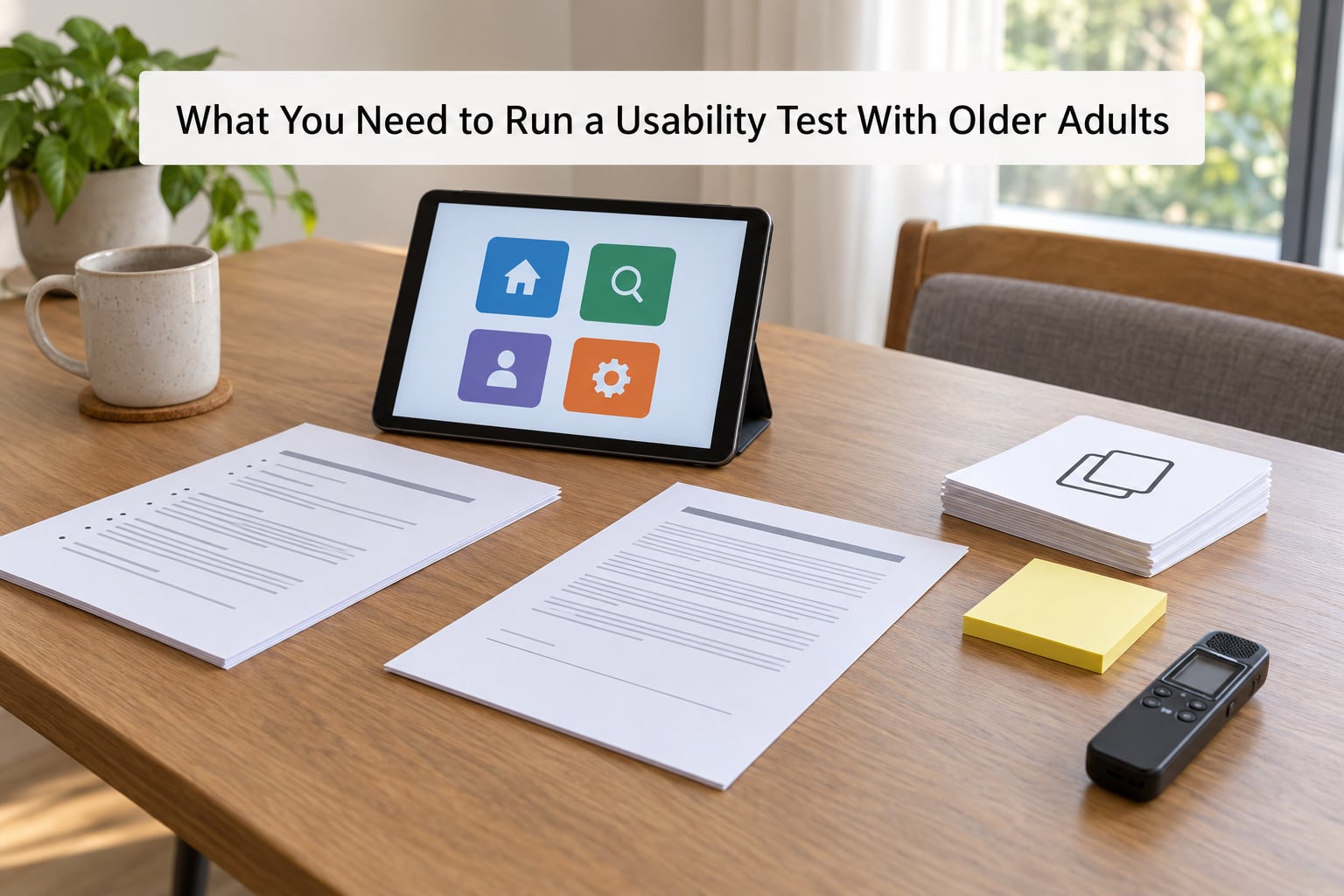
A usable test needs less equipment than people expect and more preparation than they expect. Here is what to have ready.
A build that will not move under them. For usability testing with older adults, a clickable prototype is fine only if every button you will ask about exists and responds. Nothing destroys a session faster than a participant pressing Confirm on a screen that does nothing while a moderator explains that the prototype is not finished.
Five to eight participants. Five will expose the majority of recurring barriers. Eight gives you room to notice the barrier that only shows up in the fifth session. Recruitment is usually the slowest part of this work, so start it the week you confirm your research questions.
Consent and recording materials. A one-page consent form in plain language at a large print size, plus a separate recording consent. Tell participants recording is optional and that they can ask you to stop or delete a segment at any time.
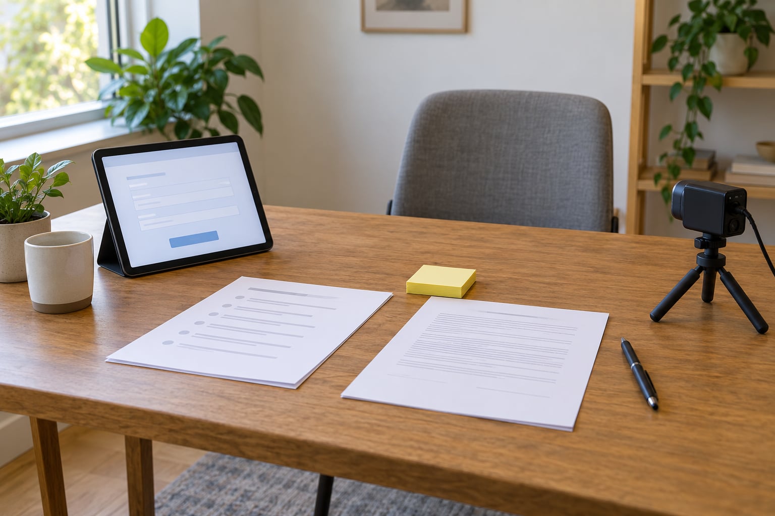
Printed task materials. One task per page, large print, plus a blank sheet for notes if the participant wants to jot something down. Researchers testing elderly participants routinely see people forget the task halfway through, so a printed copy is not optional.
A moderator script. An opening script, a consent script, a task introduction formula, three neutral probes, and a closing script. Write it out. Improvised phrasing changes between sessions, and then your sessions are not comparable.
A note-taking system. Timestamped notes in a shared document works well. Record if participants consent and use the recording only as backup, not as your primary note source.
Success criteria. Before the first session, write down what completion looks like for each task and what a barrier of each severity means for your roadmap. Deciding severity after you see the data is how you get a report that argues with itself.
Step-by-Step
1. Define what you need to learn
Start by turning a broad worry into three to five questions you can actually answer. “Is the app easy to use?” cannot be answered. “Can a first-time user find the renewal date on a parking permit page without leaving it?” can.
Then rank your journeys by risk. A login flow nobody can complete is worth more study time than a settings page that works fine. For each question, write a measurable success criterion: completion without moderator help, fewer than two wrong turns, a recovery path after a mis-tap, or a satisfaction score above a threshold you choose before you look.
Keep the test narrow. Two journeys, three to five tasks, eight participants. Depth produces evidence you can act on this quarter; breadth produces a list of things that might matter.
2. Recruit participants who reflect your users
Recruiting is the number one bottleneck in older adult user research. Panels skew younger within the 65-plus bracket, so the people who volunteer through a general panel are usually the most confident device users. That is exactly the group least likely to hit your barriers.
Channels that work in practice: senior centres and libraries that run technology programmes, community and charitable organisations, university accessibility offices, retirement communities, and caregiver support groups. A message framed as “help improve a city service” travels further than “take a usability survey,” because it gives people a reason to care about the outcome.
Write a screener with a respectful tone. Ask about the technology they use today, where they use it, their device, any assistive technology they rely on, how comfortable they are with video calls, and whether they can travel to the session or need us to come to them. Screen for behaviour and experience, not for age as a proxy for either.
Pay fairly and pay promptly. For most markets a flat honorarium tied to completing the full session works, and it should cover travel time and transit costs. Do not pay so little that people feel obliged to push through exhaustion, and do not create a dynamic where the fastest finisher earns the most. It changes behaviour in the wrong direction.
3. Prepare realistic tasks and an accessible environment
Write instructions in a neutral, imperative voice: “You have received a letter saying your appointment moved. Find the new date.” Avoid hints, avoid interface vocabulary, and avoid words your participants would not naturally use. Keep each task to one goal.
Use representative content, not lorem ipsum. A name like “Bartholomew Withers” changes how a person reads a form. Put realistic dates, reference numbers, and amounts in the screens so the participant is doing the work, not guessing at the fiction.
Set the room up before they arrive. Seating that is easy to get in and out of, a clear path to the restroom, good even lighting without glare on the screen, and a device at a comfortable angle and distance. Test the assistive settings you plan to use: screen magnification to 200 percent, a screen reader pass, increased text size, increased contrast, reduced motion. If the build fails any of those, fix it before recruiting rather than during the session.
Write your contingency for anyone who cannot complete a task unaided. Decide in advance what you will do, and keep that decision the same for every participant.
4. Run a short practice session
Rehearse the whole session with a colleague who has never seen the script. You are checking mechanics, not insight: does the recording start, does the screen share work, does the prototype stay on the intended path, does the print come out legibly, can you keep timestamped notes while talking.
Time the rehearsal. A sixty-minute session with five tasks sounds reasonable until setup takes twelve minutes and the first task runs twenty. Most moderators land on a schedule like this:
- 0 to 10 minutes: consent, recording permission, warm-up question, device and assistive technology check
- 10 to 15 minutes: practice task with something low-stakes
- 15 to 45 minutes: three to five real tasks, five minutes maximum each
- 45 to 55 minutes: debrief questions
- 55 to 60 minutes: thank you, honorarium, next steps
Also test your equipment with the assistive technology you expect to use. Screen reader audio plus a video recording is a known problem. Captions on recorded material help participants with hearing loss follow the session.
5. Moderate the session without teaching the interface
Moderating well here means being warm and being quiet. Those two are in tension, and the tension is the job.
Open with the sentence that changes the whole session. Say it clearly, out loud, every time: “We are testing the interface, not you. Nothing you do here can be wrong. If something is confusing, that is exactly the information we came for.” Older participants frequently take a failed task personally, and if they think you are judging them they will either freeze or try to perform.
Then explain the think-aloud protocol in plain terms: “As you work, please say out loud what you are looking at and what you expect to happen. If you go quiet, that is fine, just start again when you notice.” Silence is not a problem to fill.
Give the task and stop talking. Resist every instinct to narrate what the participant should see. A few prompts worth writing down:
- “What are you thinking about right now?”
- “What did you expect to happen when you selected that?”
- “What were you looking for when you first landed on this page?”
- “What would you try next?”
- “Say more about what you just did there.”
- “Is there anything about this task that felt confusing or unclear?”
- “If you could change one thing about this step, what would it be?”
Never ask leading questions. “Was that button easy to find?” invites agreement. “What were you looking for when you first landed on this page?” gets you data.
If someone gets stuck, wait a genuine ten seconds before helping. Most of the useful information lives in that pause. If you must step in, note exactly what you said, then mark the task as moderator-assisted. That label changes how you read the result later.
Watch the room as well as the screen. Some users will not say they are confused but will sigh, lean back, or go very quiet. Anxiety about making a costly mistake or triggering a scam warning can freeze someone in place rather than produce a spoken complaint.
6. Observe tasks, accessibility barriers, and emotional response
For every task record completion or not, time to first action, time to completion, errors, self-recovery without help, requests for help, and anything you had to do by hand. Those six numbers are the backbone of your report.
Alongside the numbers, log the accessibility barriers you saw. In visual terms: could they read body text at the size the app enforced, find contrast in low light, see a focus ring, hit a target, use zoom to 200 percent, read after resizing to 400 percent? In hearing terms: was audio accompanied by captions or a transcript, were alerts announced visually as well as audibly? In motor terms: did anything require a drag, a long press, a double-click, or precise placement? In cognitive terms: did the interface rely on memory of an earlier step, use unfamiliar icon-only controls, or use language that assumed digital fluency?
Physical environment matters too. Wheelchairs, walkers, and reach limits affect whether a phone-based task is even physically possible in the session, and that is a finding about your design, not about the participant.
Note emotional response separately from behaviour. Write what you observed and your interpretation as two separate lines. “Paused, exhaled loudly, looked at the note taker for about five seconds” is an observation. “Was anxious about the confirmation dialog” is an interpretation, and the next participant will not confirm it for you.
7. Debrief without shifting blame
Ask about expectations, confidence, confusing elements, content that felt written for someone else, and the version they would prefer instead. Useful openers: “What surprised you today?”, “What part felt most difficult, and why?”, “Did anything seem to assume you already knew something you did not know?”
One question I would add every time: “If this service were on your phone right now, would you use it to finish this task, or would you call or visit in person instead?” That answer tells you about trust, not just usability.
If a family member or caregiver joined the session, separate their voice from the participant’s in your notes. Well-meaning relatives will answer questions on the participant’s behalf, especially when the participant hesitates. Give the participant the task back with a neutral line such as “I would like to hear how you would handle this one.”
Close by thanking them for the specific work they did, telling them what happens next in plain language, and paying the honorarium immediately. People who feel useful at the end of a session are far more likely to return for a follow-up round.
8. Synthesize findings and prioritize fixes
Cluster the evidence by task and by barrier type. Two dimensions do most of the work here: how many participants hit the barrier, and how severely it blocked them. A barrier that affects four of eight participants and stops the task cold outranks one that affects one participant and only costs them time.
High variance in participant ability does not mean the data is unusable. It means you report per-participant rather than only in aggregate, and you segment. A task completed by the six participants on their own devices and blocked by the two who use a screen reader is two findings, not one average. Separate results by assistive technology use, by prior frequency with the task type, and by age band within your cohort.
Distinguish repeated barriers from isolated incidents, and label them that way in the write-up. Then give every priority finding an owner, an acceptance criterion, or a follow-up test. A finding without a destination is a complaint.
Retest the specific journeys you changed, with two or three participants who hit the original barrier. That is the cheapest way to know whether the fix worked and whether it broke the path for everyone else.
Common Mistakes
Recruiting only confident, tech-savvy participants. This is the most damaging mistake, because it produces a clean report that is wrong. Fix it by recruiting through channels older adults already trust, and by asking screeners about current behaviour rather than age. If your panel gives you six people aged 65 to 72 who all use a smartphone daily, keep recruiting.
Speaking for the participant. The moment you explain what a control does, the finding is gone. Fix it with a countdown in your head and a probe list you read from.
Testing trivial tasks. Sign in, click a button, read a sentence. Those tasks produce no evidence about the barriers your users actually hit. Fix it by using the journey with the most real-world stakes you can justify testing.
Using blurry placeholder content. Dummy data hides reading-level and layout problems. Fix it by filling screens with realistic names, dates, and amounts, in the language your service actually uses.
Ignoring the environment and the device. Testing a phone task on a laptop screen or in a room with heavy glare manufactures problems that do not exist and hides real ones. Fix it by testing on the device class participants really use, in lighting conditions closer to their normal environment. Home visits work well when mobility, vision, or travel is a barrier; they also let a participant use their own setup, which is often the most realistic thing you can observe.
Counting preferences as evidence. Three people saying they like a layout means three opinions. Barriers repeated across participants, in behaviour, are what justify a redesign. Fix it by reporting preference separately from observed difficulty.
Running sessions that run over. Fatigue changes what you measure. The person who handled five tasks crisply may handle the sixth badly, and you will record a design problem that is really a time-of-day problem. Fix it by capping tasks at five and watching for slowing, repeated instructions, or shortened answers as your stop signal.
Declaring success from a handful of sessions. Five people finding a flow easy does not prove it works. It proves the flow was not blocked for five people. Fix it by writing the finding as what you observed, with the number of participants attached, and by naming what you would need to see to be confident.
Two reporting habits close most of the gaps in older adult user research. Keep task-level counts in every summary, not just qualitative themes, and quote short participant statements with context rather than as headline quotes. Both stop the two failure modes in this field: smoothing over variance, and letting one vivid moment stand in for a pattern.
Frequently Asked Questions
How many older adults do I need for a usability test?
Five participants will expose most recurring barriers in a single journey, and eight is a practical ceiling for one round. Older adult cohorts vary far more than typical panels, so recruit eight and report results per participant rather than in aggregate. Recruit two extra in case of no-shows, especially when you are asking participants with mobility limits to travel.
Should every participant be over 65?
Not necessarily. Include participants who reflect the real age mix of your service, which often includes people in their fifties and sixties. What matters is matching the assistive technology, device class, and experience your actual users have. A recruiting panel that is entirely 66 to 70 will understate the barriers that appear in your oldest and lowest-confidence users.
How do I make a usability test accessible to older adults?
Start with the environment: step-free access, comfortable seating, a clear route to the restroom, and even lighting without screen glare. Then test your build at 200 percent zoom, with a screen reader, and at increased text size and contrast. Provide printed large-print task sheets, allow unhurried pace and breaks, and make recording consent genuinely optional.
Can I run a usability test with older adults remotely?
Yes, with preparation. Send a connection and setup check ahead of time, keep sessions to 45 minutes, and have a phone number ready for troubleshooting. Remote sessions work well when you need screen sharing or observation of a participant’s own device, but a support person often has to share the technical load. If travel is the barrier for your participants, a home visit may serve the research better.
How should I document and report the results?
Record completion, time, errors, self-recovery, help requests, and moderator assistance per task, then log accessibility barriers separately from observations. Segment by assistive technology use and prior experience rather than reporting one average. Write observations separately from interpretations, attach participant numbers to every claim, and finish with a ranked list where each issue has an owner or a retest.
Conclusion
Running a usability test with older adults comes down to a few unglamorous disciplines. Recruit people who actually resemble your users, including the ones who need a screen reader or take longer. Give them realistic tasks in a room that does not add friction. Say the sentence about testing the interface rather than the person, then stay quiet long enough for the truth to arrive.
If you only do one thing this week, pick your single highest-risk journey, recruit six to eight varied participants through a community channel rather than a general panel, run the sessions on a build that already passes a zoom and screen reader check, and fix the barrier that shows up most often before you test anything else. Repeat that loop once, and you will know more about your oldest users than any amount of guessing told you.