How color contrast affects readability comes down to one thing: your eye reads letter shapes by detecting edges between light and dark. When text and its background sit at similar lightness, those edges blur together, the visual system has to work harder, and reading gets slower and more tiring. Contrast ratio measures that edge strength from 1:1 (invisible) to 21:1 (black on white).
The practical floor for body text is 4.5:1 under WCAG 2.2. I check every interface I ship against that number before anyone else sees it, because contrast failures are the cheapest accessibility problems to fix and the most common to ship by accident.
Table of Contents
- What Is Color Contrast and Why Does It Matter?
- Who notices low contrast the most
- Which colour combinations have the highest readability?
- How Do People Measure Color Contrast?
- How Color Contrast Affects Readability in Real Interfaces
- What poor contrast does to reading speed and comprehension
- Interfaces where contrast quietly breaks down
- Where it matters outside the browser
- What Makes a Good Readable Color Combination?
- How Do You Test Contrast Before Publishing?
- What Common Contrast Mistakes Should You Avoid?
- Frequently Asked Questions
- What is a good contrast ratio for readable text?
- What contrast ratio does WCAG require?
- Can people with color blindness still distinguish interface colors?
- How do I check color contrast in a website or app?
- Does using more saturated colors make text easier to read?
- What contrast ratio should civic dashboards and transit maps use?
- What Should You Do First?
What Is Color Contrast and Why Does It Matter?
Color contrast is the measurable difference in luminance (lightness) between a foreground element, such as a line of text or an icon, and the background directly behind it. White text on black and black text on white are the same contrast ratio. What changes the number is how much light each colour reflects.
Vision reads shapes, not letters. An E, a 6 and an 8 are only distinguishable because of the edges and gaps that make them different. Raise the contrast between a glyph and its background and those edges resolve faster and cleaner. Lower it and the glyphs merge into a soft gray smear, especially at small sizes and on dim or washed-out screens.
That is why contrast failure hits hardest on a phone outdoors, on an aging eye, and on any display with a mediocre brightness-to-black ratio. It is also why the same page can pass a desk audit at 9 a.m. and fail completely in a bright transit hall at noon.
Who notices low contrast the most
- Low vision and age-related vision decline. Reduced contrast sensitivity is one of the most common changes in sight past fifty, and it is gradual enough that people rarely notice it happening.
- Red-green color blindness, which affects roughly 8 percent of men and 0.5 percent of women. Red and green stop being distinguishable, so a red error message and a green success message can look identical in hue and differ only by a brightness edge you cannot see.
- Blue-yellow (tritanopia) is rarer but causes exactly the same problem with a different hue pair, which is why blue-on-yellow and yellow-on-white combinations fail so badly.
- Dyslexia and other reading differences, where weak letter-to-background separation increases the visual effort of decoding each character.
- Everyone else under poor viewing conditions: direct sunlight, glare, a dim room, a worn low-quality panel, or an OLED screen turned down to save battery.
Which colour combinations have the highest readability?
- Near-black on white: 21:1. The maximum ratio, and the safest for dense body copy at small sizes.
- Near-black on off-white or light gray: roughly 16:1 to 19:1. Nearly as strong, and usually easier on the eye over long passages.
- Very dark navy on white: about 14:1. Comfortable for headlines and interface labels where brand colour matters.
- Near-white on dark charcoal: about 14:1. The workhorse pairing for dark mode and for dark control-room dashboards.
- White on a saturated mid-dark blue: roughly 8:1. Passes even the AAA text threshold.
- Bright colors as text: a saturated red on white sits near 4:1 and a yellow on white sits around 1.3:1, which is effectively invisible. Vivid does not mean readable.
How Do People Measure Color Contrast?
A contrast ratio compares two relative luminance values using the formula (L1 + 0.05) divided by (L2 + 0.05), where L1 is the lighter of the two. Relative luminance itself comes from the sRGB values of the colour, weighted for how the three channels contribute to perceived brightness. The result is a number from 1 to 21.
You never need to do that arithmetic by hand in practice. You enter two colours into a checker, or the checker reads them out of your CSS or design file. What you still need to know is what number to aim for.
WCAG 2.2 splits requirements by text size and by element type. Text at 18pt (24px) or 14pt bold (about 18.7px) counts as large text and gets a lower threshold, because bigger glyphs give the visual system more to lock onto.
| Element | WCAG 2.2 AA | WCAG 2.2 AAA | Success criterion |
|---|---|---|---|
| Normal text (under 18pt / 14pt bold) | 4.5:1 | 7:1 | 1.4.3 Contrast (Minimum) / Enhanced |
| Large text (18pt, or 14pt bold) | 3:1 | 4.5:1 | 1.4.3 Contrast (Minimum) / Enhanced |
| Icons, form borders, focus rings, chart elements | 3:1 | Not required | 1.4.11 Non-text Contrast |
| Logos and brand text you cannot change | No minimum | No minimum | 1.4.3 exception (logotype) |
Two practical notes. First, WCAG uses ratios rather than “perceived brightness,” which is why a designer can look at a pairing, judge it as fine, and still be wrong for a measurable group of readers. Second, WCAG 3 and the APCA model in draft replace the flat ratio with a model that accounts for typography, weight and display range; APCA generally wants a little more contrast than WCAG 2 for small text and a bit less for very large text. Build against 2.2 today and you will not be exposed when 3 lands.
How Color Contrast Affects Readability in Real Interfaces
What poor contrast does to reading speed and comprehension
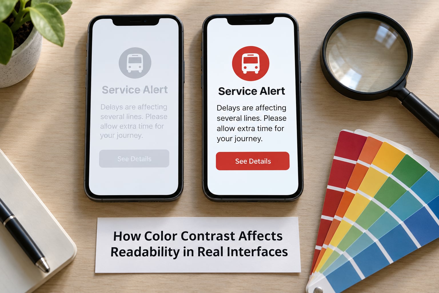
When the contrast edge is weak, the eye makes more fixations per line, holds each line of text longer, and slips back to re-read more often. Studies of visual resolution, including work on contrast polarity and reading of low-contrast print, consistently find that legibility drops as contrast drops, and that readers compensate by reading more slowly. For a form, that slowdown shows up as abandoned sessions. For a transit alert, it shows up as a missed platform change.
Contrast also raises cognitive load. When the letters barely separate from the background, some of the brain’s capacity goes to resolving shapes instead of holding meaning, and long passages get tiring sooner. Users describe this as eye strain or headaches and rarely connect it to the design.
Interfaces where contrast quietly breaks down
- Secondary and placeholder text. Muted gray helper text is usually the first thing to fail an audit and the hardest thing to get approved for a fix.
- Links inside paragraphs. Low-contrast blue on white, or a link colour too close to the body colour, disappears exactly when a reader is scanning. Underline links or change the weight.
- Hover and focus states. If the hovered background drops contrast, the label becomes unreadable for exactly the user who hovered deliberately. Treat hover and focus as first-class states and hold 4.5:1 in each of them.
- Disabled buttons. Faded to near-invisible, these fail the 3:1 non-text rule and leave users unable to tell whether a control exists.
- Error and success messages. Red and green only tell the story if the reader can see both hues, and an estimated one in twelve men cannot. Add an icon, a label and a position in the message.
- Charts and map layers. Two series separated by a thin hue difference become one grey mass on a small screen. Differentiate by lightness, line weight, marker shape and direct labels.
- Text over photographs. Contrast changes with every pixel of the image behind it, so there is no single passing value without a treatment.
Where it matters outside the browser
WCAG governs web content, not physical signage, but the principle holds for a self-service kiosk in a lobby, a parking payment screen in direct sun, or a control-room wall in a transit operations centre. Those screens are read at three metres, often at an angle, sometimes in gloves, and almost never by the person who calibrated them.
The civic case is sharper still. A bus arrival board or a flood alert banner has one job: be understood by someone moving, distracted, and in a hurry. Color is a poor carrier for that message on its own. Shape, position, size and wording do the real work, and color reinforces them.
Dark mode adds its own wrinkle. Pure white text on pure black is technically a 21:1 ratio and can look harsh, because bright glyphs bleed into dark surroundings (halation) and thin strokes visibly thicken. Most production dark themes land around 4.5:1 to 12:1 using off-white text near 90 percent lightness on near-black surfaces, and OLED power savings come from large black surface areas rather than from pushing text to maximum brightness.
What Makes a Good Readable Color Combination?
A good pair is not a fashionable pair. It is a pair where the foreground clears the threshold for that specific text size, weight, font and background, in the state it appears, on the device it appears on.
Font size and weight genuinely change the target. A 12px caption needs more contrast than a 48px headline, and bold text holds its shape at a lower ratio than a hairline weight. If a pair is failing and you cannot change the colours, that is the first lever: not 11px regular.
The next thing to unlearn is that saturated colours read better. Saturation is the intensity of a hue, not its lightness, and contrast cares only about lightness. A vivid yellow headline on a white page is around 1.3:1 and simply vanishes. The brightest-looking designs are often the least readable ones.
| Pairing | Approximate ratio | Verdict |
|---|---|---|
| #1A1A1A on #FFFFFF | about 17:1 | Safe for long-form body copy |
| #FFFFFF on #111111 | about 18:1 | Safe for dark UI and dense data |
| #FFFFFF on #1B4F9C | about 7:1 | Meets AAA for normal text |
| #767676 on #FFFFFF | about 4.5:1 | Exactly at AA, fine for helper text |
| #9E9E9E on #FFFFFF | about 2.8:1 | Fails AA, too light for any text |
| #F2C744 on #FFFFFF | about 1.5:1 | Unreadable as text |
| #D32F2F on #FFFFFF | about 4.6:1 | Passes AA, but pair with an icon and label |
For long articles, an off-white background such as #F7F7F5 with near-black text often reads better than pure white with pure black. Harvard’s accessibility guidance recommends it, and the reasoning holds up: pure white plus maximum darkness creates the strongest halation edge, which can make letters look heavier and blurrier. Keep it subtle and check it at your real body size, not zoomed in.
How Do You Test Contrast Before Publishing?
Test the states, not just the palette. A pair that passes on the design tile can fail in the dropdown, the disabled row, the error banner and the footer link nobody opened during the audit.
- Pick your anchor pair first. Decide on body text colour and page background, then verify the ratio before touching anything else. Almost everything else is measured against these two.
- Run a checker on the real values. Paste the hex codes into the WebAIM Contrast Checker for the AA and AAA numbers. In Chrome, Edge and Firefox, the built-in developer tools colour picker reports the contrast ratio against the sampled background as you move it.
- Audit every state and variant. Default, hover, focus, active, disabled, visited link, error, success, placeholder, tooltip, dark mode. Automate the ones a tool can catch (see step 7) and check the rest by eye with a grayscale filter.
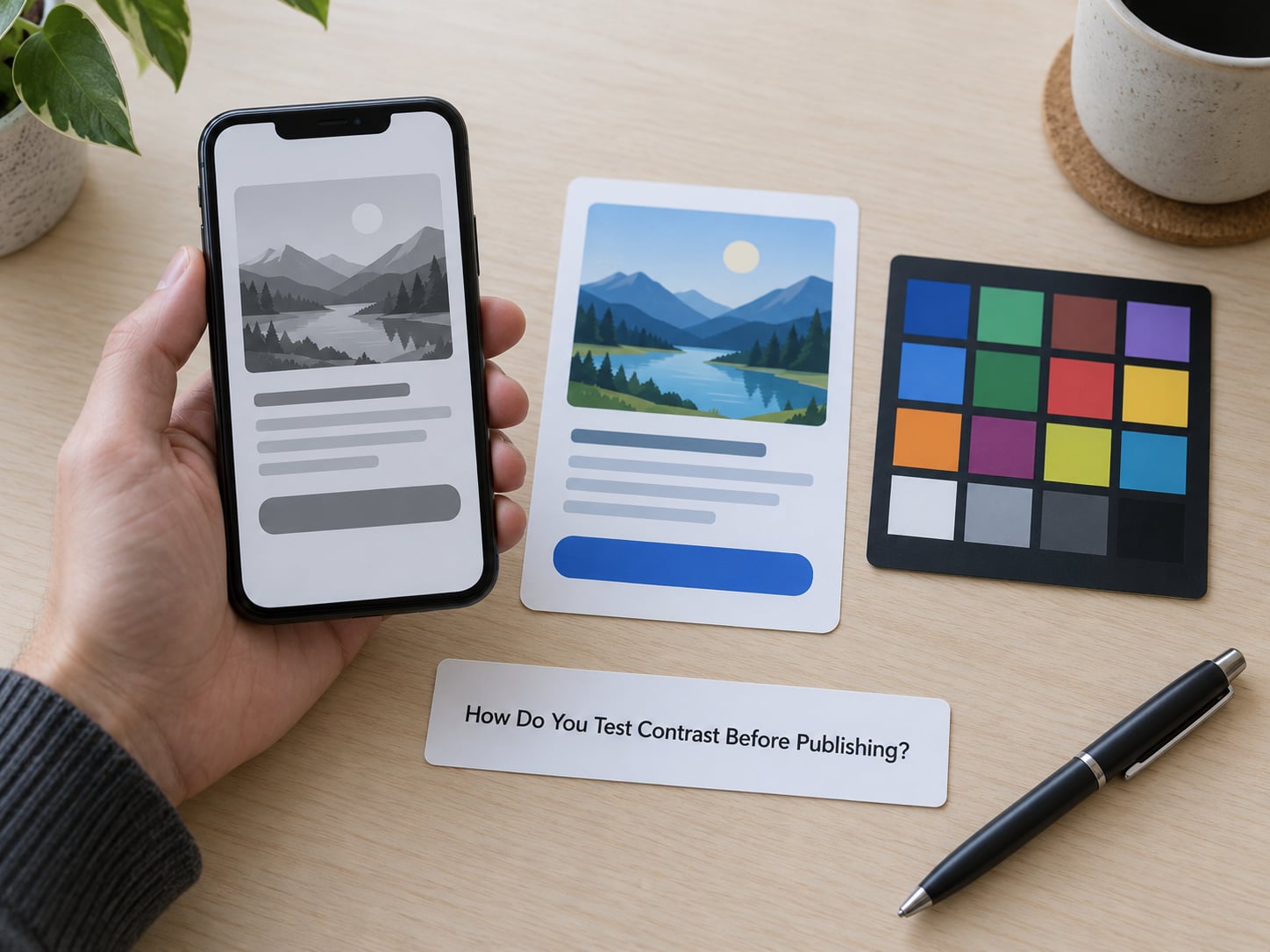
- Run the grayscale test. View the page in grayscale on your phone. If states that are supposed to be different stop being different, the difference was carried by hue alone and it is gone for a color-blind reader too.
- Check on a real device, in real light. An office monitor at full brightness is the least representative surface your users have. Test outdoors, at low brightness, and at arm’s length.
- Fix text over images with a scrim. Put a solid colour block behind the text instead of guessing at overlay opacity: a full-width panel at your body text colour, or a gradient scrim running from about 70 percent opacity behind the text zone to fully transparent above it. Then re-check the ratio against the panel, not the photo.
- Automate it so it cannot regress. Add an automated scan to your build so new colour combinations are checked on every pull request, and encode approved colours as design tokens with the passing values documented next to them.
| Tool | What it checks | Use it when |
|---|---|---|
| WebAIM Contrast Checker | A single color pair against WCAG 2 levels | Quick verification of any hex pair, no sign-up |
| Browser developer tools | Live ratio against the sampled background | Adjusting a color in place while building |
| Color Contrast Analyser (desktop) | Live page values plus a simulation of color-vision deficiency | Auditing a running site, including hover and focus |
| Design-tool plugins (Stark, ColorSafe) | Contrast inside Figma or Sketch frames | Stopping bad pairs before they reach code |
| Automated scanner in CI | Every page in a codebase, per build | Preventing regressions across a whole product |
One caveat worth repeating from accessibility practice: automated tools catch a fraction of real problems. They cannot see whether a chart legend works, whether an error message is clear, or whether the reading order makes sense. Use them as a floor, not a finish line, and pair them with manual checks and real user testing.
What Common Contrast Mistakes Should You Avoid?
These are the failures I see most often, and the fix for each.
- Muted gray helper text. Anything from #999999 upward on white fails. Darken the token to about #767676 or darker, or drop the helper line entirely.
- Light text on a saturated colour. White on a mid-bright brand colour often lands near 3:1. Darken the button background until white clears 4.5:1.
- Relying on colour alone. Red and green status dots, a red field border with no message, a green and red chart legend. Add an icon, a word, or a line style, so the meaning survives grayscale.
- Text over photography with no treatment. Fix with a scrim or solid block, as described above, rather than hoping the image stays dark enough.
- Gradients that fail at one end. A button that passes at the top of its gradient can fail at the bottom. Check the lightest stop against the text, and check the darkest stop against the label.
- Placeholder text set too light. Placeholder text is real text and needs the same 4.5:1. On most forms, darkening the placeholder is the single fastest win.
- Faded disabled controls. Opacity applied to a whole button drags the label under the threshold. Reduce the contrast between the control and the page instead, and keep the label legible at 3:1.
- Navy text on a dark photograph header. If the photo is variable, fix the text colour and let the overlay move, rather than the other way round.
And the one that gets resisted most: the brand palette. You rarely need to replace a brand colour to fix contrast. Darkening the brand hue toward the same family, or using it for a background block with white text on top, keeps the identity while clearing 4.5:1. Practitioners on r/Design reach for that first, and it works far more often than swapping in a colour from outside the brand.
Frequently Asked Questions
What is a good contrast ratio for readable text?
For body text, 4.5:1 is the practical floor and the WCAG 2.2 AA minimum. Large text at 18pt, or 14pt bold, can drop to 3:1. For long articles I aim for 7:1 or better, using near-black on off-white. Icons, focus rings and form borders need 3:1 as UI components. Measure real values, not impressions, because a pair that looks fine often lands under the line.
What contrast ratio does WCAG require?
WCAG 2.2 Success Criterion 1.4.3 sets 4.5:1 for normal text and 3:1 for large text at level AA, and 7:1 and 4.5:1 at level AAA. Criterion 1.4.11 separately requires 3:1 for non-text elements such as icons, input borders, focus indicators and chart shapes. Logos and brand wordmarks are exempt as logotypes. WCAG 3 and APCA are still drafts and revise the model rather than the practical thresholds.
Can people with color blindness still distinguish interface colors?
They cannot rely on hue, and that is the design lesson. In red-green color blindness, affecting about 8 percent of men, a red error state and a green success state can look identical except for brightness. Blue-yellow deficiency behaves the same way with other hues. Build interfaces so lightness, shape, icon, label and position carry the meaning, then use colour to reinforce it. A grayscale check on your phone shows you in seconds what you have missed.
How do I check color contrast in a website or app?
Open the page, open developer tools, and use the built-in colour picker, which reports the ratio against the sampled background as you adjust it. For a quick single check, paste two hex values into the WebAIM Contrast Checker. The Colour Contrast Analyser desktop tool audits a live page and simulates colour-vision deficiency. Then check hover, focus, disabled, error and dark mode states, run a grayscale pass, and add an automated scan to your build so nothing regresses.
Does using more saturated colors make text easier to read?
No. Saturation is the intensity of a hue, while contrast depends only on the lightness difference between text and background. A fully saturated yellow on white sits near 1.3:1 and is effectively invisible, and a vivid brand orange on white often lands under 3:1. Saturated colours work well as large background blocks, button fills and chart accents. Keep the text near-black or near-white on top of them, and check the measured ratio rather than the vibrancy of the swatch.
What contrast ratio should civic dashboards and transit maps use?
Treat them as public-facing reading surfaces and target 7:1 for route labels, alert text and timetable numbers, with 3:1 as the floor for lines, markers, icons and boundaries. Kiosks and wayfinding signs are read at distance and in glare, so test them outdoors at their real viewing angle. Never let colour alone mark a service disruption, and pair every red, amber or green state with a symbol, a word and a fixed position.
What Should You Do First?
Start by pinning down your two anchor colours: body text and page background. Measure them, and if the pair fails, adjust the lighter or darker value until it clears 4.5:1 rather than guessing.
Then do the quick pass. Run the page through a contrast checker and a grayscale filter, fix the muted gray text, the links inside paragraphs, and the disabled buttons, and check hover and focus states as carefully as the default one. Those three fixes clear most real failures.
Last, add an automated check to your build and a contrast requirement to your design tokens, so the palette stops drifting back into soft, pretty, unreadable. Treat colour as a supporting cue in every case, never as the only way information reaches the person reading it.