Making a map with open source GIS tools comes down to four moves: load your data as layers, set the coordinate reference system, style and label those layers, then build a layout and export or publish it. QGIS does all four for nothing, including commercial and government work. A first thematic map takes about an hour, and the hard part is almost never the clicking. It is the coordinate system.
Open source GIS tools are software you can download, inspect, extend and redistribute under licences the Open Source Initiative recognises. On the desktop that usually means QGIS for drawing maps, GRASS GIS and GDAL for analysis and format conversion, and Leaflet, MapLibre or OpenLayers plus GeoServer for putting a map on a website. Nothing in the chain needs a per-seat licence or a per-view bill, which is the argument that usually wins the budget conversation in a city hall.
The audience here is usually civic: open data publishers, mobility and energy analysts, developers who need a map embedded in a city web page, and people learning QGIS in an ordered way because the software itself gives you no obvious starting sequence. That last point is why the workflow below is numbered the way it is.
Table of Contents
- What You Need
- Step-by-Step
- Step 1: Define the Map Question
- Step 2: Find and Inspect Open Data
- Step 3: Load the Data Into QGIS
- Step 4: Check and Fix Coordinates
- Step 5: Style and Label the Map
- Step 6: Create a Map Layout and Export
- Common Mistakes
- Frequently Asked Questions
- Is GIS difficult to learn for a beginner?
- What is the best free GIS software?
- How do I make a map from a CSV with latitude and longitude?
- How do I add a free basemap to QGIS without paying for an API key?
- How do I publish a QGIS map on the web?
- Is QGIS better than ArcGIS, and what are the disadvantages of QGIS?
What You Need
You need four things: a desktop GIS, one dataset with geometry attached to it, a decision about the coordinate reference system before you style anything, and a basemap for context. The desktop piece is the easy decision. QGIS 3.x is the one to install first, it runs on Windows, macOS and Linux, and the OSGeo foundation publishes it under the GNU General Public License, so there is no commercial-use question to answer.
On data, start with vector. A vector layer is points, lines or polygons with an attribute table attached, and that table is what turns a shape into a map: without a field to colour by, you have geometry and no story. Raster data, which is a grid of pixels like an aerial photo or a land cover grid, is worth adding for background context but it is a different toolset and a different set of mistakes.
The coordinate reference system is the piece people skip and then lose an afternoon to. Every coordinate in your data means nothing without a declaration of how those numbers relate to the earth. If that declaration is missing or wrong, your map will draw, and it will draw in the ocean. Decide this in Step 4, before you start styling.
For the basemap, you do not need an account or an API key. OpenStreetMap raster tiles can be added directly in QGIS, which gives you street names and coastlines to check your layers against. Just read the tile usage policy before you put one on a public page with heavy traffic, and put an OpenStreetMap credit line on the map either way.
| Tool | Role | Licence | Best for |
|---|---|---|---|
| QGIS | Desktop mapping and analysis | GNU GPL, no licence fee | Thematic maps, print layouts, editing data |
| GRASS GIS | Desktop analysis | GNU GPL, no licence fee | Raster analysis, hydrology, terrain modelling |
| gvSIG | Desktop viewing and basic cartography | GNU GPL / LGPL | Lightweight viewing on modest hardware |
| GDAL and OGR | Command line conversion and reprojection | MIT-style open licence | Format conversion, batch work, scriptable pipelines |
| GeoPandas with Shapely, GeoPy and Matplotlib | Python analysis and quick maps | BSD and compatible open licences | Reproducible maps inside a notebook or script |
| Leaflet, MapLibre GL, OpenLayers | Browser map libraries | BSD, BSD and Apache 2.0 | Interactive maps embedded in a page |
| GeoServer, MapServer | Map servers | GNU GPL and MIT-style open licences | Serving WMS, WFS and vector tiles to many users |
| PostGIS | Spatial database | GNU GPL | Large attribute tables, joins, versioning, multi-user editing |
Two optional pieces are worth installing later rather than on day one. The Processing Toolbox inside QGIS gives you buffers, joins, clipping and hundreds of geoprocessing tools without leaving the app. The Felt plugin packages a QGIS project and its layers into a shareable web map, which practitioners on r/gis describe as a very easy route to getting a project onto the internet when you have no developer on hand.
Step-by-Step
Step 1: Define the Map Question
A map should answer one question for one audience. “Show bike infrastructure” is not yet a question; “which neighbourhoods within two kilometres of a planned tram line have no protected bike lane” is. The second version tells you your layers, your extent and your symbology before you open the software.
Write down three things: the audience, the geographic area, and the single thing the reader should take away. If the audience is a city council, the takeaway is usually a comparison between districts. If it is the public, the takeaway is usually “this is near you”, which changes the scale and the labels.
Fixing the area early matters more than it looks. A city-wide map and a neighbourhood map are different designs, not different zooms. Deciding now saves you restyling everything later.
Step 2: Find and Inspect Open Data
Open data is where civic maps come from, and there is a lot of it. City open data portals publish building permits, bike networks, tree inventories and crash records. Socrata portals and data.gov aggregate federal datasets, Natural Earth gives you country and coastline boundaries at several scales, and OpenStreetMap gives you roads, buildings and land use almost anywhere on earth.
| Source | Typical content | Watch for |
|---|---|---|
| City and county open data portals | Trees, permits, bike lanes, transit stops, zoning | Formats vary per city; GeoJSON and CSV are common |
| Socrata portals | Census, health, safety, budget records with geometry | Download as GeoJSON or use the export endpoint |
| data.gov | Federal datasets across agencies | Inconsistent CRS and field naming |
| OpenStreetMap via QGIS | Roads, buildings, land use, amenities | ODbL licence, so credit it visibly |
| Natural Earth | Admin boundaries, coastline, populated places | General purpose, not parcel detail |
Before downloading, inspect the dataset page rather than the file. Check the update date, the geographic coverage, the licence and the field list. A dataset last touched four years ago is fine for historical analysis and misleading on a “current conditions” map.
Then read the fields. Open data is rarely tidy, and column names like OBJECTID_1 or the_real_name are common. Write down which field holds the value you want to map and which field holds the name you want to label with.
Step 3: Load the Data Into QGIS
Open QGIS Desktop and use the Layer menu, Add Layer, then Add Vector Layer. In the Data Source box browse to your file. For a city dataset you will usually have a GeoPackage, a GeoJSON file or a shapefile; pick whichever exists and click Add. The layer appears in the Layers panel on the right-hand side and draws on the canvas.
A CSV of addresses or points is handled differently. Use Layer, Add Layer, Add Delimited Text Layer, browse to the CSV, and set the X field to longitude and the Y field to latitude. Set the geometry type to Point, leave the coordinate reference system as the file default for now, then Load. If the rows appear in a tight grid, you almost certainly swapped the two columns.
Raster layers load through Layer, Add Layer, Add Raster Layer. Large rasters can make the canvas slow immediately, so keep them underneath your vector work.
To give yourself context, add an OpenStreetMap basemap. Either install QuickMapServices from Plugins, Manage and Install Plugins, or add an XYZ layer and paste a tile URL template such as https://tile.openstreetmap.org/{z}/{x}/{y}.png. A basemap is reference only: it is not your data and it should sit at the bottom of the layer stack, switched off before you export.
Step 4: Check and Fix Coordinates
If your data loaded and landed somewhere plausible, you can skip ahead. If it landed in the wrong place, this is the step that fixes it, and every later fix is worse.
Three things have to be right: the CRS declared on each layer, the CRS declared for the project, and the datum those coordinates are measured against. Right-click the layer, choose Properties, open the Source tab and read the coordinate reference system line. “Undefined” or “Unknown” means the file arrived without a .prj file, which is the single most common problem with civic shapefile downloads.
Fixing it depends on what you actually know. If you know the real system, set the layer to it, then use the same system for the project under Project Properties, CRS. If you do not know it, that is not a formatting error you can undo; guessing produces a plausible-looking map in the wrong hemisphere, so check the source documentation instead.
The vocabulary is worth learning because the three commands do different things. Assign CRS declares a system you are certain about. Set CRS renames the current system. Transform CRS converts coordinates into a new system. Only the third one moves your points on the map, which is exactly why “Set CRS” is the fix that breaks projects.
Verify before styling. Use the Identify tool and click a feature you can locate in real life, a known park, a city hall address. Read the coordinates in the identify panel and confirm they fall where you expect. On-the-fly reprojection is convenient but hides errors, so give the canvas a visual check too: zoom to the basemap and confirm your boundaries sit on top of real streets.
Two systems cover most of what you will meet. EPSG:4326 is geographic WGS84, latitude and longitude in degrees, and it is what web tiles use as their reference. EPSG:3857, Web Mercator, is what every browser basemap draws in. For local measurement and equal-area work, a UTM zone for your area, EPSG:326xx north or 327xx south, gives distances in metres.
Step 5: Style and Label the Map
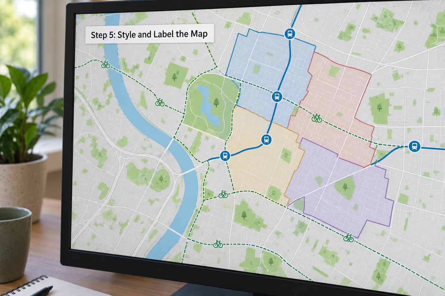
Styling starts with picking a renderer that matches your question. Single symbol is for showing locations. Categorized groups features by a text field and gives each group its own colour, which is what you want for zoning classes or service types. Graduated symbol assigns a colour ramp across a numeric field and is the standard choice for a choropleth of rates or counts. Rule-based lets you write expressions for mixed conditions, such as highlighting districts above a threshold. Point layers also offer heatmaps, useful for crash and sensor data.
Choose colour with restraint. Use a single-hue or two-hue ramp from the ColorBrewer palettes in the Style panel rather than a rainbow, because rainbow ramps invent boundaries that are not in the data. Keep category counts low; past about seven categories, readers stop distinguishing colours and a table does the job better.
Symbols carry more meaning than fill colour. Points want shapes that differ in silhouette, not just colour, so a district map still works in greyscale. Lines need width and dash patterns to separate a proposed route from an existing one. Keep a minimum line width near 0.5 mm so features survive at print size, and remember that a screenshot at full screen brightness will always overstate how pale your pastels look on paper.
Labels need their own pass. Open the Labels tab in layer properties, choose the label field, set the font, and add a white buffer of about 1 mm so text stays readable over busy fills. Label density is the usual failure: if names overlap into a grey smear, use the “Show all labels for this layer” setting off and enable collision handling, or label only the features that matter to the question.
Filter before you style. A rule like “status = ‘open'” in the layer filter, or a query in Layer Properties under Source, keeps the map honest about what it shows. The Processing Toolbox is the next step up: buffers, joins by location, centroids and dissolves there turn raw data into map-ready analysis, and every one of those operations is a repeatable model rather than a one-off click.
Step 6: Create a Map Layout and Export
The canvas is not the finished map. Go to Project, New Print Layout, pick a page size such as A4 landscape, and build the map as designed objects.
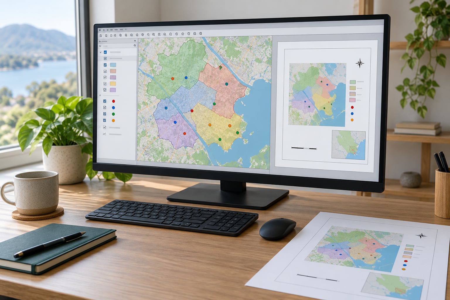
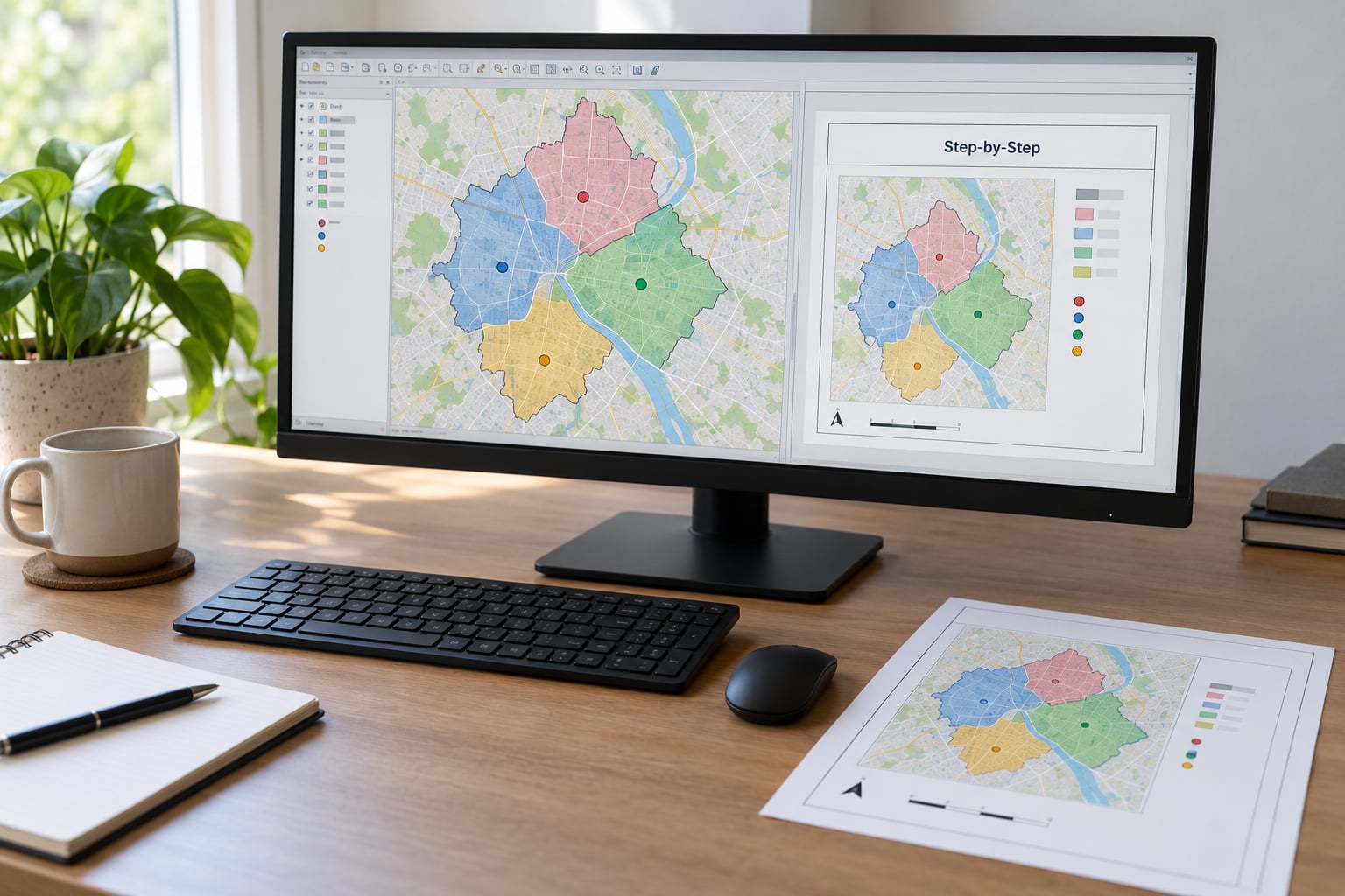
Add a map frame first, then draw it over most of the page. Use the item’s zoom controls to match the map frame to your canvas extent. Everything else goes on top: a title as a Label item, a Legend tied to the map frame so it updates itself, a Scale Bar set to the map’s units, and a North Arrow, which needs an SVG you can download and point the item at.
Add a source note as plain text at the bottom, naming each dataset, its publisher and its licence, plus OpenStreetMap credit if you used it. That line is not decoration. It is the condition on most open data and on the ODbL, and a map that omits it is a map you cannot publish.
Export from the layout with Export as PDF for reports and print, Export as SVG for later editing in a vector tool, or Export as Image for a web graphic at 150 to 300 dpi. Leave a margin around the page edge so nothing clips, and check the smallest text at full zoom before you commit.
For a series of maps, use the Atlas, which drives one layout from an attribute table and produces one page per feature. That is the route to a per-district or per-year report set without rebuilding anything.
If the map needs to be interactive, stop at styling and export the layer instead of the picture. Save the styled layer as GeoJSON or GeoPackage, then draw it with Leaflet, MapLibre GL or OpenLayers in a web page. Practitioners generally point beginners at Leaflet for a basic project and OpenLayers when the application needs advanced rendering, with MapLibre GL as the modern vector-tile successor.
Common Mistakes
Your data landed in the ocean or the wrong continent. The layer has no CRS, or it has the wrong one. Open Layer Properties, Source and read the value. Set it to the system the publisher documented, and set the project to match. If a layer moves thousands of kilometres when you switch systems, you renamed it rather than transformed it.
The basemap is blank blue. The canvas is still showing the whole planet at a zoom where tiles do not exist. Right-click the basemap layer and choose Zoom to Layer, or zoom into your data extent. If tiles still fail to load, check your internet connection and the tile URL template.
Basemaps crawl and the canvas lags. This is a known QGIS complaint, with users reporting it more often than ArcGIS users expect. Turn off layers you are not using, lower raster layer resolution under layer Settings, and build overviews for big rasters so QGIS can zoom without decoding the whole file every time.
Labels vanish or turn into a smear. Three usual causes: the label field contains nulls, the font size is below about 7 pt at print scale, or labels collide and collision handling drops them. Check the field first, then the font, then turn on collision detection.
Too many colours. If a reader cannot describe the pattern in one sentence, the map is doing too much. Cut to six or fewer categories, or use a graduated ramp with four or five classes.
The exported file is enormous. Almost always one of three things: a 32-bit float GeoTIFF when an 8-bit file would do, a far higher resolution than the paper needs, or a raster with no compression. For a report at 300 dpi and A4, roughly 3500 by 2500 pixels is already generous.
The legend explains nothing. A default legend lists all categories including empty ones. Rename the layer to a readable title, drop unused categories, and make sure the legend text order matches the visual order of the map.
The layer turned grey and hatched after a restart. The file path moved. QGIS stores project paths, and a relative path that no longer resolves breaks the layer. Keep project files next to their data folders, or set paths to relative under Project Properties.
The map has no source credit. Add the attribution line at layout level, not only on a web page footer. Most open data licences and OpenStreetMap’s ODbL require visible credit on the map itself.
A few design habits carry more weight than any specific style choice. Grey out everything that is not your subject, put the thing you want read first at the top of the legend, label only what the question needs, and never ship a map without a scale bar if it shows distance. If someone can answer your map question in five seconds, it worked.
Frequently Asked Questions
Is GIS difficult to learn for a beginner?
Not for a first map. If you can handle a spreadsheet, you can load a city dataset into QGIS, colour it by a field, label it and export a PDF in an afternoon. The steep part is the coordinate reference system, which is why Step 4 comes before styling in this guide. Give yourself a weekend before you touch spatial analysis tools.
What is the best free GIS software?
QGIS is the default answer, and on r/gis it is described as the obvious choice when you want a full GIS with a graphical interface. GRASS GIS goes deeper on analysis, gvSIG is lighter for basic viewing, and GeoServer or MapLibre serve maps to a browser. For a civic team producing static and interactive maps, QGIS plus Leaflet covers most needs.
How do I make a map from a CSV with latitude and longitude?
In QGIS use Layer, Add Layer, Add Delimited Text Layer, point X at the longitude field and Y at the latitude field, then set the coordinate reference system to EPSG:4326. Confirm the geometry column reads Point and click Load; the rows draw immediately. Spot-check two points with the Identify tool against a basemap before you style anything.
How do I add a free basemap to QGIS without paying for an API key?
OpenStreetMap tiles need no account. Install QuickMapServices from Plugins, Manage and Install Plugins, or add an XYZ layer with a template such as https://tile.openstreetmap.org/{z}/{x}/{y}.png. Zoom to your data extent first, since a blank blue canvas usually means the view is still at world scale. Credit OpenStreetMap on the map and read the tile policy before heavy public use.
How do I publish a QGIS map on the web?
Export the styled layer as GeoJSON or a GeoPackage rather than exporting a picture, then render it in a page with Leaflet, MapLibre GL or OpenLayers. Leaflet suits a basic project and OpenLayers handles advanced applications, per practitioners on r/gis. If you have no developer available, the Felt plugin packages the project and its layers into a shareable web map.
Is QGIS better than ArcGIS, and what are the disadvantages of QGIS?
QGIS is free under the GNU General Public License, including commercial and government work, and it runs on Windows, macOS and Linux. The honest costs: heavy raster layers can render slowly, plugin quality varies, and organisational support comes from documentation and community rather than a vendor help desk. ArcGIS still wins on vendor support and enterprise integration.
Start with one dataset and one question. Load it, confirm the coordinate reference system against a basemap, pick a renderer that matches the field you are mapping by, and build a print layout with a legend, a scale bar and a source credit. That single map, finished properly, teaches more than any tutorial, and the second one takes half the time.