
To visualize data for a nontechnical audience, pick the simplest chart that answers the viewer’s actual question, write the finding into the title in plain words, and give every number its context. Most of the work happens before you open a charting tool, not after. The chart is the easy part.
A resident looking at a transit chart has never heard of a denominator. A budget officer comparing two quarters does not want a tooltip. What they both need is to know what happened, whether it matters, and what to do about it — and that comes down to a handful of decisions you make before drawing anything.
I have watched analysts present perfectly accurate charts that nobody acted on, and plain bar charts with the source, the date range and an honest caveat that changed a room’s decision in five minutes. The difference is almost never software.
Below is the process I use: seven steps, roughly an hour of prep for a single chart once you have the data, and no specialist skill beyond a spreadsheet and any free charting tool.
Table of Contents
- What You Need
- How to Visualize Data for a Nontechnical Audience: Step by Step
- 1. Define the audience’s decision or question
- 2. Simplify the data before designing the visual
- 3. Choose the simplest chart that fits the message
- 4. Write a plain-language headline and annotations
- 5. Remove visual clutter and direct attention
- 6. Test the visual with a real nontechnical reader
- 7. Publish the visual with context and a clear next step
- Common Mistakes
- Frequently Asked Questions
- What is the best way to visualize data for a nontechnical audience?
- How do I make a chart easier for beginners to understand?
- Should I use a map when presenting city data?
- How can I explain uncertainty without confusing the audience?
- How do I check whether a data visualization is truly understandable?
- Conclusion: Start With the One Sentence
What You Need
Five things, and four of them are decisions rather than software. Skipping the first one is why so many visuals land flat.
- The audience. Who is physically in the room or scrolling the page, and what do they already know? A city council, a grant funder and a neighbor reading a public dashboard need three different versions of the same dataset.
- The decision or question. One sentence. Are they deciding whether to fund something, understanding a trend, or checking whether a service is working?
- The source data. Clean enough to plot. Know the date range, the population covered, and what is missing.
- A tool. A spreadsheet with built-in charts handles most of this work. Nothing more elaborate is required to start.
- Plain-language context. A definition of the measure, the source, the period covered, and one sentence on what the audience should do next.
A few terms get thrown around in this field, and two of them are worth pinning down now because they shape every later choice.
Visual encoding means how a number is turned into something the eye can measure. Humans read position on a shared scale and bar length more accurately than angle, area or colour intensity. That ordering, worked out by Cleveland and McGill, is the whole reason a bar chart beats a pie chart for comparison — it is not a style preference.
Chart junk, a term from Edward Tufte’s 1983 work on quantitative display, means everything on the chart that does not carry data: heavy gridlines, decorative gradients, 3D shadows, background images, boxed legends for a two-colour chart. His data-ink ratio measure pushed the same idea. Delete the junk and what remains is either information or noise you should also delete.
The UN Statistics Division’s D4N training module on communication products makes the same point in a different register: a story written for non-technical readers paints a wide brush, includes an overview of the issues, and avoids acronyms on first use. Nobody has to know your field to follow the chart.
How to Visualize Data for a Nontechnical Audience: Step by Step
1. Define the audience’s decision or question
Write down the one thing you want someone to understand or do when they finish looking. Not a topic, not a subject area — a single outcome.
“Transit ridership” is a topic. “Decide whether to restore the evening service on Route 14” is a decision. The second version tells you which year to show, which lines to compare, and whether the reader needs a recommendation at the bottom.
There are only three useful goals: understand something they have no intuition for, compare two or more options, or act on a decision. Each one implies a different chart, and mixing them in a single visual is a common way to lose people.
Then check what the audience already believes. Analysts on the r/datascience forum describe the same recurring moment: a defensible model that cannot be explained upward, because nobody ever asked what the room thought was true before the slide went up. If the room assumes the worst bus route is the most-used route, and your chart shows the opposite, you are not presenting data — you are asking them to update a belief, and you should say so in the title.
2. Simplify the data before designing the visual

Reduction before design. A chart can be perfectly readable and still say nothing, because it contains fourteen columns the viewer has to ignore.
- Drop fields nobody asked about. If your source sheet has thirty columns and the question needs four, work with four.
- Aggregate until the pattern shows. Weekly is usually the right grain for a monthly report; hourly is usually noise on a printed page.
- Round for reading, keep precision for analysis. 42 percent, not 41.87. 1.2 million, not 1,193,442. Nontechnical viewers read the first two digits and ignore the rest.
- Show the denominator. “311 requests fell 12 percent” is meaningless without knowing the total. A count falling while the population grows can still be a per-person rise.
- Say what is missing. “Three stations had no sensor data in March” is a sentence that saves a follow-up argument later.
Small numbers need their own care. A count of two complaints can read as a collapse in service rather than noise. Either label it as preliminary or leave it off the chart entirely.
Jargon removal happens at this stage too, and it is cheaper here than later. Write out the definition of every measure in plain words and cross out any acronym you would not say out loud in a public meeting.
3. Choose the simplest chart that fits the message
Match the chart to the question the audience is asking. This is the fastest way to raise comprehension in a chart you already have.
| What the audience is asking | Use | Why it reads without training |
|---|---|---|
| Which one is bigger? | Bar chart, sorted descending | Bar length on a shared zero baseline is the encoding people read most accurately |
| Is it going up or down? | Line chart | One continuous series over time is the shape people already expect time to have |
| How does this break into parts? | Stacked bar or a plain table | A single total split into its pieces; pie charts lose this as soon as there are more than three slices |
| Where does it happen? | Map, only if location is the point | Area is the weakest encoding, so a map needs a sorted table beside it to be useful |
| What is the exact number? | Table | Nobody reads an exact figure off a bar; they want the one number in front of them |
| When is it busy? | Heat map or simple line | One block per period, no axes to explain, works on a printed page |
Two rules carry most of the weight. Start a bar chart at zero, always, because a truncated axis exaggerates a small difference into a dramatic one and a nontechnical viewer has no way to detect it. And leave out dual-axis combo charts, small multiples and 3D effects — they encode information through machinery the audience has not been trained on.
The tier rule generalises this. General audiences read bars, lines and simple part-to-whole. Analytical audiences who work with numbers weekly can handle combo and scatter charts. Social and press audiences get a single value or a single comparison, because a chart that needs a sentence of explanation gets cropped out of the feed. Match the complexity to the familiarity, not to the sophistication of your analysis.
Bar charts can show qualitative data — categories with labels rather than numeric values — because bar length simply ranks the categories. What they cannot do is show a continuous measurement. A survey rating from 1 to 5 is fine; a weight in kilograms belongs on a line or a dot plot.
The full catalogue runs to dozens of chart types, and most of them are wrong for this audience. Filter it to the six or eight above and you have already made the hardest choice.
4. Write a plain-language headline and annotations
The title is the most valuable sentence on the page. A descriptive title names the chart; an insight title states the finding.
“Bus ridership by month, last two years” describes. “Evening ridership on Route 14 has grown 40 percent since the 6 p.m. frequency change” does the work. The second version means a reader who only sees the headline in a search result still gets the point.
Support it with three things:
- Plain labels. Category names in the words people use — “Night shift”, not “shift_type_code_3”.
- Source and period underneath. One line, small, always present. It reads as professionalism and it prevents the “where did this come from” tangent.
- One annotation per change that matters. A short note pinned to the point where something changed — a service change, a policy date, an opening — carries more weight than three paragraphs of explanation.
Keep a swap list handy for jargon. “Utilization” becomes “how full the buses are”. “Variance” becomes “the difference from the target”. “Per capita” becomes “per person”. “Confidence interval” becomes “the likely range”. “Annualised run rate” becomes “if it kept going for a year”. Each swap costs you nothing and removes the moment where a viewer quietly stops following.
5. Remove visual clutter and direct attention
Everything that is not data or a label is competing with the message. Take it out, then put the attention back deliberately.
- Colour carries meaning. One neutral colour for everything, one accent for the bar you are talking about. Never a rainbow — a different colour per bar invents categories that do not exist in the data.
- Keep it colourblind-safe. Red and green together are unusable for roughly one in twelve men. Use blue and orange, or vary lightness as well as hue, and never make colour the only carrier of meaning.
- Cut the gridlines until only the ones you need to read a value remain. Horizontal and light beats a full grid.
- Sort deliberately — descending by default for comparison, chronological for trend. Alphabetical order makes the reader do the ranking themselves.
- Use whitespace to separate the point from everything else.
- Direct-label where you can and drop the legend. A legend forces the reader to look away and match colours back to categories.
Accessibility is not optional here, because a public-facing chart is going to be read by someone using a screen reader or with low vision. Give every image real alt text that describes the finding in words, not the file name — “Bar chart showing evening bus ridership doubling on Route 14 after the service change” rather than “chart.png”. Keep body text and labels at a comfortable size, check contrast, and make sure the chart still works in grayscale. Visual polish is also read as a proxy for care: inconsistent fonts and clashing colours make correct numbers look careless.
Add honesty about uncertainty without losing the room. Instead of drawing error bars that nobody can interpret, label the range in words next to the value — “between 8,000 and 9,500 riders”. Round ranges beat technical whiskers for a lay reader, and they are more honest than dropping the variation entirely, which is what most people do to keep the chart clean.
6. Test the visual with a real nontechnical reader
Nobody is present to tell you the chart failed. Most failures are silent, so you have to run the check yourself.
The five-second test. Show the chart to someone outside your field for five seconds, then hide it. Ask what the main point was. If they cannot say it in one sentence, the title is descriptive rather than insightful, or the accent colour is pointing at the wrong bar.
The teach-back question. Ask “what would you tell your neighbour this shows?” A viewer who answers with the chart’s mechanics — axis ranges, colours, the data source — has read the chart rather than the message. One in ten people conflates a rising trend with a rising rate; if you hear that, the denominator needs to be on the visual itself, not just in the notes.
The misread check. Ask what they think happens next. If your answer and theirs differ, you have an annotation problem. Add one line of context where they went wrong rather than hoping they will catch it later.
Then revise and test again. Two rounds usually does it. This sounds like fussing and it is the cheapest step in the whole process.
7. Publish the visual with context and a clear next step
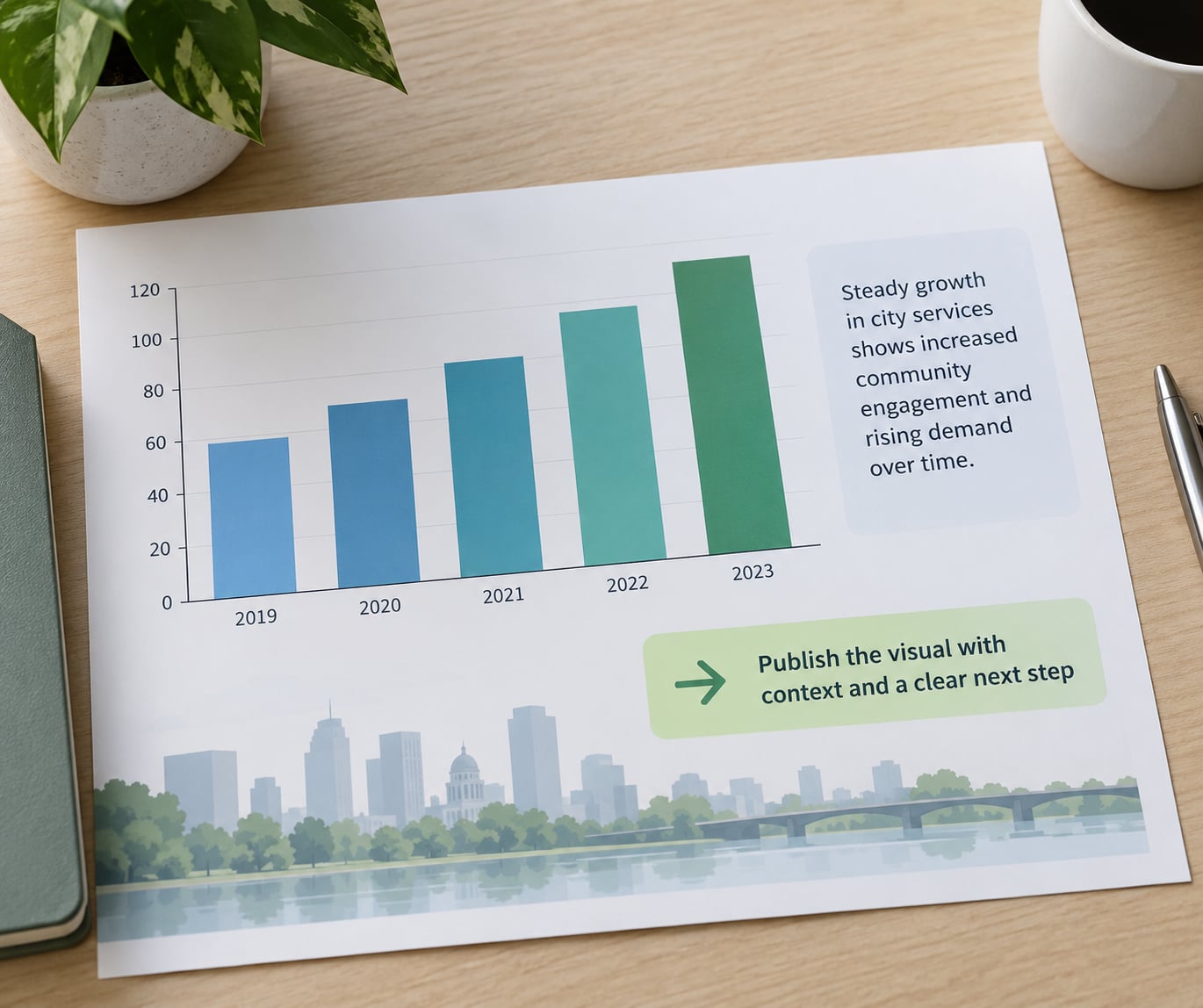
A chart released on its own is an unanswered question. Five short additions close it: what the measure means, where the data came from, what period it covers, what it cannot tell you, and what to do next.
The limitations line does more work than it looks like it should. “Counts come from reported requests; some requests are submitted by phone and counted separately” or “No sensor data for three stations in March” tells the reader exactly how far to trust the shape of the line. Reviewers and public commenters forgive a caveated number far more readily than one that turns out to be wrong.
The delivery format also changes what belongs on the page. In a live meeting, the slide carries the headline, the single chart and the source, and the recommendation stays in your mouth rather than on the screen. In a printed report or PDF, the annotation and the methodology note have to be on the page because nobody is there to explain them. On a dashboard, show one chart and one question per screen, because dashboards fail when they are built around available metrics instead of what somebody actually asked — the complaint that comes up repeatedly in r/analytics.
Update it. A visual with no date on it is worse than no visual, and a quarterly revision note tells readers the numbers still reflect reality.
Common Mistakes
These are the failures a nontechnical viewer cannot detect on their own, which is what makes them dangerous. In each case the chart is not obviously broken — it is quietly misleading.
| What the chart does | What a lay reader takes from it | The fix |
|---|---|---|
| Bar axis starts at 400 instead of zero | A 3 percent difference looks like a collapse | Start at zero, or switch to a line chart where truncation is defensible and label it clearly |
| Every bar a different colour | Categories exist that the data never defined | One neutral colour, one accent for the bar you are discussing |
| Descriptive title | The reader concludes nothing at all | Rewrite as the finding, in their words |
| Red and green as the only signal | Some viewers see one flat colour | Blue and orange, or vary lightness as well as hue |
| Dual-axis combo chart | A coincidence of two unrelated scales looks like cause | Two charts, or index both series to the same start |
| Percentage with no denominator | The scale of the problem is unknowable | Put the count beside the percentage, always |
| Uncertainty removed for cleanliness | A precise-looking number that is not precise | Label the range in words beside the value |
| Twelve charts on one page | Nothing is the message | One chart, one message, and put the rest in an appendix |
| Dashboard of every available metric | Filters nobody uses, insight nobody finds | Start from the questions users actually ask, not from the data you have |
| Technical labels and acronyms | The reader quietly stops following | Swap each term for the words people use, and define it once |
Two habits close most of these. Show one chart per idea, so the page has a point rather than a data dump. And write the takeaway sentence yourself at the top; if you cannot write it in plain words, you do not yet understand the pattern well enough to present it.
The fear worth pushing back on is dumbing data down until you lose credibility with expert viewers. You lose credibility by hiding uncertainty, not by using plain words. A chart with a stated source, a stated period, a stated limitation and a rounded number is more credible than the same chart in expert notation, because everyone can check what it is claiming.
Frequently Asked Questions
What is the best way to visualize data for a nontechnical audience?
Start from the one decision you want the viewer to make, then pick the chart that matches it: bars for comparing options, lines for change over time, a table for exact values. Write the finding into the title rather than describing the chart, round the numbers, and show the count beside any percentage. Keep one neutral colour with a single accent, and give the reader a source and a date range underneath.
How do I make a chart easier for beginners to understand?
Cut what is not data, then cut the labels they cannot parse. Start the axis at zero, sort the bars, delete most gridlines, and direct-label instead of using a legend. Replace jargon with the words the audience actually uses, and give every percentage its denominator. Finally, show it for five seconds to someone outside your field and ask them to state the point in one sentence.
Should I use a map when presenting city data?
Only when location is the finding itself, such as which districts lost service. People judge area badly, so a map alone is hard to compare. Pair it with a short table sorted by value, which gives the ranking without requiring the reader to eyeball shapes. If your point is a total, a magnitude or a gap over time, use a bar or line chart instead and skip the map entirely.
How can I explain uncertainty without confusing the audience?
Say it in words next to the number rather than drawing error bars. Write the likely range in plain text, for example between 8,000 and 9,500 riders, and explain in one sentence what causes the range, such as partial sensor coverage. Keeping uncertainty visible protects your credibility far more than a clean-looking chart does, because it tells the reader exactly how far to trust the shape.
How do I check whether a data visualization is truly understandable?
Use two tests. The five-second test: show the chart to a nontechnical reader briefly, then hide it and ask what the main point was. The teach-back test: ask them to explain the chart to a neighbour, and listen for whether they describe the finding or just describe the mechanics. If they misread the trend, add the missing context to the visual itself, then test again with someone new.
Conclusion: Start With the One Sentence
Write the sentence you want the viewer to leave with, before you touch the data. Everything after that is a decision about how much detail will still be understood once that sentence lands.
Pick the chart the question calls for, strip out anything that is not carrying data, say the finding in the title, keep the uncertainty visible, and test it with one person who does not know your field. Updated for 2026, that process works the same for a council briefing, a printed report and a public dashboard — only the delivery changes.