
How to use Jupyter notebooks for data exploration is a question that comes up the moment someone gets their first real CSV file and does not know where to start. The short answer: launch a notebook, load the data into a pandas DataFrame, then work through shape, missing values, distributions, group comparisons and plots in that fixed order, writing a markdown note at every step so the file explains itself later.
On a small dataset the whole loop takes about twenty minutes. On a multi-year civic dataset, expect an afternoon the first time and minutes after that, because the cleaning decisions get written down as you go.
I work in notebooks almost every day, mostly with open city data: transit boardings, curb permit records, building energy readings, air quality monitors. The workflow below is the one I actually run, trimmed down to the parts a beginner can repeat without getting lost.
Table of Contents
- What You Need
- Step-by-Step: How to Use Jupyter Notebooks for Data Exploration
- 1. Start a Clean Jupyter Environment
- 2. Load and Inspect the Dataset
- 3. Check Data Quality and Clean Common Problems
- 4. Explore the Data with Useful Questions
- 5. Create Clear Visualizations
- 6. Turn Findings into Decisions
- 7. Document, Save, and Share the Notebook
- Common Mistakes
- Overwriting cells and losing the story
- Plotting before cleaning
- Absolute paths
- Out-of-order execution and hidden state
- Ignoring missing values
- Reading correlation as causation
- Frequently Asked Questions
- How can I use Jupyter Notebook for data analysis?
- What is the best way to use Jupyter notebooks day to day?
- Why do so many data scientists use Jupyter notebooks?
- Is it better to use Jupyter Notebook or VS Code?
- Is it better to use Google Colab or Jupyter Notebook?
- Is .py or .ipynb better?
- Conclusion
What You Need
You need Python 3.9 or newer, a way to install packages, four libraries, and one dataset. That is the whole list, and every item has a free option.
- Python 3.9+ on your machine. Check with
python --versionin a terminal. - An installer for packages. Either
pip, which ships with Python, or the Anaconda distribution, which bundles Python, Jupyter and the common data libraries in one download. Anaconda is the easier first move if you have never touched a terminal. - Jupyter itself, installed with
pip install jupyterorconda install jupyter. Jupyter Notebook is the classic single-document interface; JupyterLab is the newer multi-panel workspace that also runs .ipynb files. - pandas for loading and reshaping tables, numpy underneath it, matplotlib for base charts and seaborn for the statistical ones.
pip install pandas numpy matplotlib seaborncovers it. - A dataset. A CSV is the easy case. City open data portals usually publish CSV, GeoJSON and sometimes XLSX exports; your notebook can read the first two directly, and Excel needs one extra library.
The basic skills are smaller than people expect. You need to read a Python function call, understand lists and dictionaries loosely, and be willing to read an error message. You do not need to be a programmer, and you do not need to know statistics beyond knowing that a median is more stubborn than a mean.
If you would rather not install anything, Google Colab runs notebooks in a browser with no setup and gives you a free GPU. It is genuinely faster for a one-off analysis, and it becomes frustrating the moment you need a specific package version or a data file over a certain size, so most people end up running both. VS Code with the Jupyter extension is the third option, and it wins when you want a real editor, Git, and debugging next to the notebook.
Step-by-Step: How to Use Jupyter Notebooks for Data Exploration
The workflow runs in seven steps: set up a clean environment, load and inspect the data, check quality, ask questions, visualize, interpret, then document and share. Skipping ahead to the charts is the single most common mistake, because you end up drawing a picture of a dataset you have not actually understood yet.
1. Start a Clean Jupyter Environment
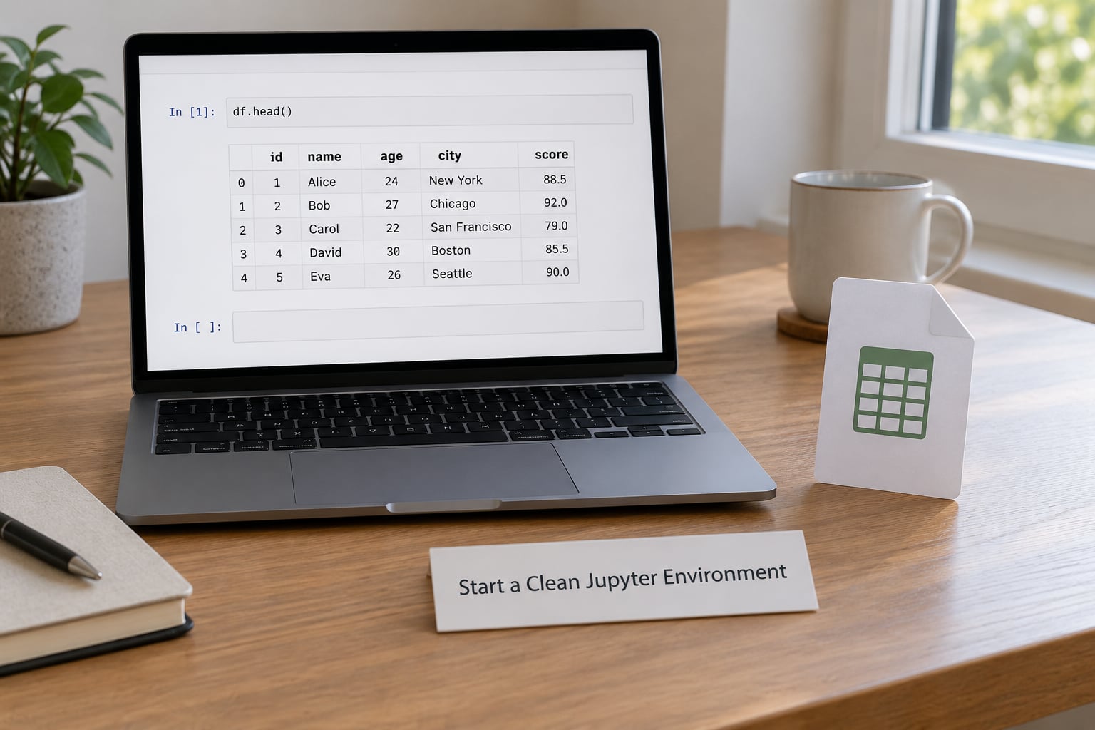
Start a clean Jupyter environment by launching the notebook server from the terminal, then create one notebook per question instead of one giant file per project.
From your project folder, run:
python -m jupyter labThat opens JupyterLab in your browser at localhost:8888. The classic interface uses python -m jupyter notebook instead, which opens one document at a time and is the better choice if you like a distraction-free view. Neither choice is wrong; the file format is identical.
Create a folder structure before you create any notebook. I keep data/ for raw downloads that never get edited, notebooks/ for .ipynb files, and outputs/ for exported HTML. Naming conventions like 01_ridership_load.ipynb and 02_ridership_profile.ipynb tell you what a file does six months later.
You will know the environment is ready when a new notebook opens with an empty cell, the kernel indicator in the top right shows a filled circle with no error, and Shift+Enter on a cell containing print("ready") returns ready immediately.
Three cell types carry the whole system. Code cells run Python and show output. Markdown cells render headings, bullet lists and tables as prose, which is where your reasoning goes. Raw cells pass content straight through to the underlying nbconvert formats and rarely matter for exploration.
2. Load and Inspect the Dataset
Load and inspect the dataset by reading it with pandas and then asking four questions: how big is it, what are the columns, what do the types look like, and what does the first few rows actually say?
import pandas as pd

df = pd.read_csv("data/transit_boardings_2026.csv")
df.head()
df.tail()
df.shape
df.dtypes
head() and tail() catch broken headers and truncated uploads instantly. shape gives you rows and columns as a tuple, which is the first honest measure of whether your approach fits. dtypes shows whether a date came in as a string and whether a numeric column was parsed as text because of one stray character.
City open data files often arrive with a few landmines. A UTF-8 byte order mark produces a column called Unnamed: 0 or a mangled first header, which pd.read_csv(..., encoding="utf-8-sig") fixes. Semicolon-separated European exports need sep=";". Anything with mixed types can be forced with low_memory=False. Read the dataset’s documentation page before guessing; it usually tells you the delimiter and the date format outright.
Add a quick sanity cell right after loading that prints the date range and the count of unique values in the columns you care about. If a dataset you expected to cover five years shows one, you have found your first problem before it reaches a chart.
print(df["service_date"].min(), df["service_date"].max())
print(df["route_id"].nunique())
3. Check Data Quality and Clean Common Problems
Check data quality by measuring missing values, duplicates, inconsistent labels and implausible numbers, then fix only what you can justify and leave the rest documented.
df.isnull().sum().sort_values(ascending=False)
df.duplicated().sum()
df.describe(include="all")
Missing counts tell you where to look, but the useful number is the share: df.isnull().mean() times one hundred gives a percentage you can reason about. A column with 2 percent missing values often just means those specific dates were holidays. A column missing 60 percent is a different column that you probably should not include at all.
Some cleaning actions are safe. Parsing a date column with pd.to_datetime(df["service_date"]), stripping whitespace with .str.strip(), and dropping exact duplicate rows with df.drop_duplicates() change nothing you cannot undo.
Other actions need domain judgment. Imputing a missing headway value with the route median is fine if you say so in markdown. Deleting every record with a missing fare amount is a decision that quietly changes your dataset, and if you are analyzing late-night service, those records are probably exactly the ones you care about. Write down what you removed and why, right there in a markdown cell.
Outliers need the same care. A ridership count of 2,000,000 in a table where the maximum is normally 40,000 is a data error. A count of zero at 4am on a Sunday is a real event. df.describe() gives you the range to spot the first kind, but only local knowledge catches the second.
4. Explore the Data with Useful Questions
Explore the data by turning vague curiosity into specific questions and letting value counts, grouped summaries and date trends answer them.
Start with the columns that have the fewest distinct values, because those give the fastest answers.
df["route_id"].value_counts().head(10)
df.groupby("route_id")["boardings"].agg(["count", "mean", "median", "std"])
df.groupby(df["service_date"].dt.month)["boardings"].sum()
The median matters more than the mean in ridership and energy data. A single holiday spike or a month-long sensor outage moves an average by a lot and a median by almost nothing, and when you report a typical route you mean the median.
Grouped summaries let you compare categories the way a stakeholder would ask about them: which route carries the most riders, which hour is busiest, which day of week runs lightest. Date-based aggregation turns a flat table into a trend.
daily = df.groupby("service_date")["boardings"].sum()
daily.plot(title="Daily boardings")
Relationships come next. df.corr(numeric_only=True) gives a correlation matrix between numeric columns, which is fast screening and not proof of anything. A correlation between rainfall and bike-share trips in one city over one spring is a hypothesis, not a finding.
5. Create Clear Visualizations

Create clear visualizations by matching the chart to the question: bars for comparing categories, lines for change over time, histograms and box plots for distributions, scatter for relationships.
import seaborn as sns
import matplotlib.pyplot as plt

sns.histplot(data=df, x="boardings", bins=40)
plt.title("Boardings per service hour")
plt.xlabel("Boardings")
plt.ylabel("Count of records")
Three habits fix most bad exploration charts. Always label both axes with units, because “values” helps nobody. Set figure size explicitly with plt.figure(figsize=(10, 4)) so charts are readable in a notebook cell instead of being a thumbnail. And when you compare groups, start the y-axis at zero for bar charts, because a truncated axis exaggerates differences in a way readers will not notice.
Use color for one idea at a time. Seaborn’s default palette is fine; picking six arbitrary colors for six routes is not. If you need to highlight one route out of twenty, grey the rest.
6. Turn Findings into Decisions
Turn findings into decisions by writing each result as a short statement, then asking what operational question it would change.
Exploration that ends with plots on a screen has not finished. After each chart, write a markdown cell with three sentences: what the chart shows, what it probably means, and what you would check next.
“Ridership on Route 14 dropped 31 percent after March, and the drop lines up exactly with the construction closure on the corridor. Worth confirming against the closure date in the public works feed before we brief the transit committee on it.” That sentence is the actual deliverable. The chart is evidence for it.
Be disciplined about causation. Exploratory data analysis finds patterns, and patterns generated enough of them that a meaningful share are coincidence. Anything you intend to act on deserves a check the notebook cannot do for you: another time period, a comparable route, an outside source.
7. Document, Save, and Share the Notebook
Document, save and share the notebook by writing the reasoning in markdown, restarting the kernel and running everything top to bottom, then exporting to HTML or a script.
Markdown-first writing is what separates a notebook someone can rerun in a year from a pile of cells. Headings give structure, one or two sentences above each block explain why it exists, and comments stay in the code where they belong.
Then run the honesty check. Restart the kernel and run all cells from the top with Restart Kernel and Run All Cells from the Kernel menu. If it fails, you had hidden state: a variable created in a cell you ran earlier and never wrote down. This takes thirty seconds and it is the difference between a notebook that works and one that only works on your machine.
Use relative paths like data/transit_boardings_2026.csv rather than an absolute path to your home directory. Pin your dependencies with pip freeze > requirements.txt, and commit the notebook plus its requirements file to Git with sensible commit messages so the history reads as a record of thinking.
To share, use jupyter nbconvert --to html your_notebook.ipynb for a self-contained file that anyone can open, or --to script to strip it down to plain Python when the analysis needs to become part of a pipeline. Quarto does the same job with better formatting if you want a polished report.
Common Mistakes
The most common notebook mistakes are all cheap to fix once you recognize them. Here is the mistake, what actually goes wrong, and the specific correction.
Overwriting cells and losing the story
Running the same cell again repeatedly while editing in place leaves one final output and no record of what changed. Duplicate the cell instead with Esc then C, edit the copy, and keep the earlier attempt. The failed version is often the most useful thing in the file when someone asks why you dropped a column.
Plotting before cleaning
Charts drawn on unprofiled data hide missing records instead of showing them. Move all plotting after your quality checks, and if you must plot early to see what you are dealing with, label that cell as diagnostic.
Absolute paths
FileNotFoundError on a file that plainly exists usually means the notebook is running from a different working directory. Switch to paths relative to the notebook folder, and confirm where you are with import os; print(os.getcwd()).
Out-of-order execution and hidden state
If a cell works only because of something you ran an hour ago, the notebook is lying to the next person. Restart and run all, and where you cannot remove the hidden dependency, move that code into a function or a module so it is visible.
Ignoring missing values
pandas handles NaN quietly: sums skip them, counts skip them, and two different operations on the same column silently disagree. Check df.isnull().sum() before every summary and state in markdown what you did about it.
Reading correlation as causation
A correlation matrix on a large enough dataset will produce something that looks significant almost every time. Treat it as a filter for what to investigate, and confirm with an outside source or a designed comparison before anyone acts on it.
A few habits make daily exploration smoother. Restart the kernel every hour or so rather than only at the end, so the first crash happens while you still remember what you were doing. Keep notebooks small and named for the question they answer. And when you find yourself writing the same six lines of cleaning code in three notebooks, that code belongs in a module imported at the top.
The one thing that consistently separates useful notebooks from messy ones is deciding, before you type anything, what question the notebook answers. If you cannot write that sentence in a markdown cell at the top, the notebook will drift, and you will spend an hour exploring something nobody asked about.
Frequently Asked Questions
How can I use Jupyter Notebook for data analysis?
Use a Jupyter Notebook by loading a dataset into a pandas DataFrame and working through a fixed sequence: inspect shape and columns, check missing values and duplicates, summarize with describe and value_counts, group data to compare categories, plot distributions and trends, then write your conclusions in markdown cells. The notebook keeps your code, its output and your reasoning in one file that reruns from top to bottom.
What is the best way to use Jupyter notebooks day to day?
Write one markdown cell at the top stating the question, keep small code cells that each do one thing, restart the kernel and run all before sharing, use relative paths and a pinned requirements file, and move repeated cleaning code into an imported module. Exploratory data analysis is the notebook’s home turf; move analysis into plain Python modules once the exploration has settled.
Why do so many data scientists use Jupyter notebooks?
Because a notebook closes the loop between writing code and seeing the result. You re-run a single cell after changing one argument, a plot redraws instantly, and the same file carries the code, the outputs and the prose that explains it. That makes exploratory work fast and makes findings easy to hand to someone else without rebuilding your analysis from a script.
Is it better to use Jupyter Notebook or VS Code?
They solve different problems and work well together. Jupyter Notebook gives you the fastest interactive loop with almost no setup, which is why it is the default for exploration. VS Code gives you a real editor, Git, debugging and file management, which is why serious teams open the same .ipynb file inside it. Many practitioners pair a Jupyter web interface with VS Code on the same notebook directory.
Is it better to use Google Colab or Jupyter Notebook?
Google Colab is better when you want zero setup, a free GPU and a throwaway analysis you can share by link in a minute. Local Jupyter is better when you need specific package versions, large local data files, offline work or scripts that run without a browser session. Plenty of people keep both: Colab for quick prototypes, local Jupyter for anything that has to survive.
Is .py or .ipynb better?
Use .ipynb for exploration, teaching and anything you need to explain in prose, because a notebook holds code, output and narrative together. Use .py once the logic settles, because plain scripts import cleanly, take unit tests, lint properly and drop into a pipeline or scheduled job. The usual path is exploring in a notebook, then exporting the reusable parts with nbconvert –to script.
Conclusion
Start with the smallest version of this: open a notebook, write one markdown cell naming the question, load the file with pd.read_csv, and run df.shape followed by df.isnull().sum(). Those two calls tell you most of what you need to know about whether the rest of the workflow is worth continuing.
Work through the seven steps in order every time, keep the reasoning in markdown, and run the whole notebook from a fresh kernel before you share it. That habit is what separates an exploration other people can trust from a screenshot in a slide.