Civic apps fail the people who need them most when the words are hard to read and the menus are deep. Knowing how to design for low literacy users means treating reading load as a first-class constraint: short sentences, one task per screen, icons paired with plain labels, spoken guidance that works offline, and testing with people whose experience matches the people you are building for.
This guide walks through the process a team can actually run, whether you are a two-person municipal team or a funded product squad. It takes roughly a working month from first observation to a tested redesign of a single task.
Table of Contents
- What You Need
- Research access
- Accessibility standards as a floor
- Content assets
- A realistic test device
- A script meant to be read aloud
- Step-by-Step
- Start With Research, Not Assumptions
- Write Short, Direct Instructions
- Make the Main Action Obvious
- Use Images, Audio, and Alternatives Together
- Test With Real Users and Real Tasks
- Common Mistakes
- Frequently Asked Questions
- Is plain language the same as accessible content?
- Do icons work better than text for low-literacy users?
- How do you test a design with users who cannot read?
- What is the difference between low literacy and low digital literacy?
- When do voice interfaces help, and when do they fail?
- Conclusion
What You Need
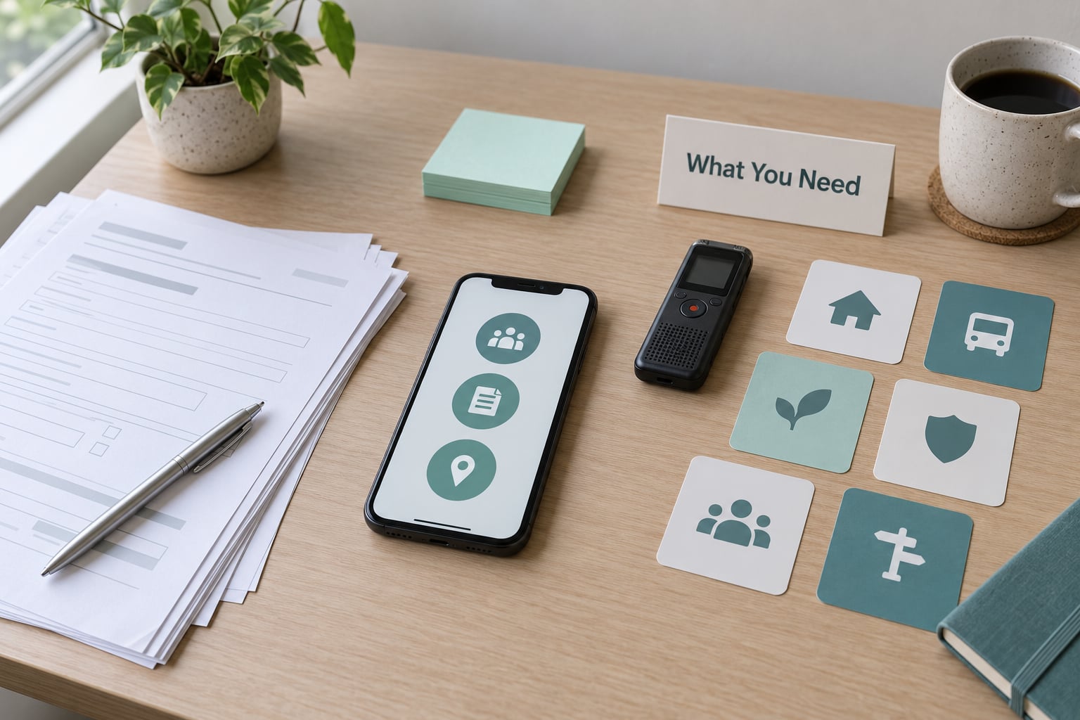
Start with observation, not a questionnaire. Watch five to eight people complete the one task your service exists for, in their own language, on whatever phone they own. Everything else you buy is secondary to that.
Research access
You need a local-language researcher or a community organisation who already has the trust of the people you want to reach. Recruitment through a market-day intercept, a community health worker, or a faith leader usually works better than a research panel, and it costs less.
Accessibility standards as a floor
WCAG 2.2 and the POUR framework cover perceivability, operability, understandability and robustness. Treat them as the minimum, not the finish line: they were written for disability and assistive-technology audiences, so they say little about reading load, unfamiliar vocabulary or unfamiliar metaphors.
Content assets
Collect your city’s existing style guide, any Easy Read or plain-language guidance, the real terms people use for your service locally, and photographs of how people actually queue, ask and confirm things at a counter today. Screenshots of the paper form are worth more than a requirements document.
A realistic test device
Test on a mid-range phone with the screen brightness turned down and a throttled connection. If your layout breaks when images are slow to load, your users on intermittent service will break with it.
A script meant to be read aloud
Write every test instruction as a spoken sentence a facilitator can say without awkwardness. If a sentence reads badly out loud, it will read badly on screen too.
Essential activities, if you can only fund some: observation of real users, one round of task-based testing after your redesign, and a local-language reviewer for your microcopy. Nice to have: a formal accessibility audit and a screen-reader pass.
Step-by-Step
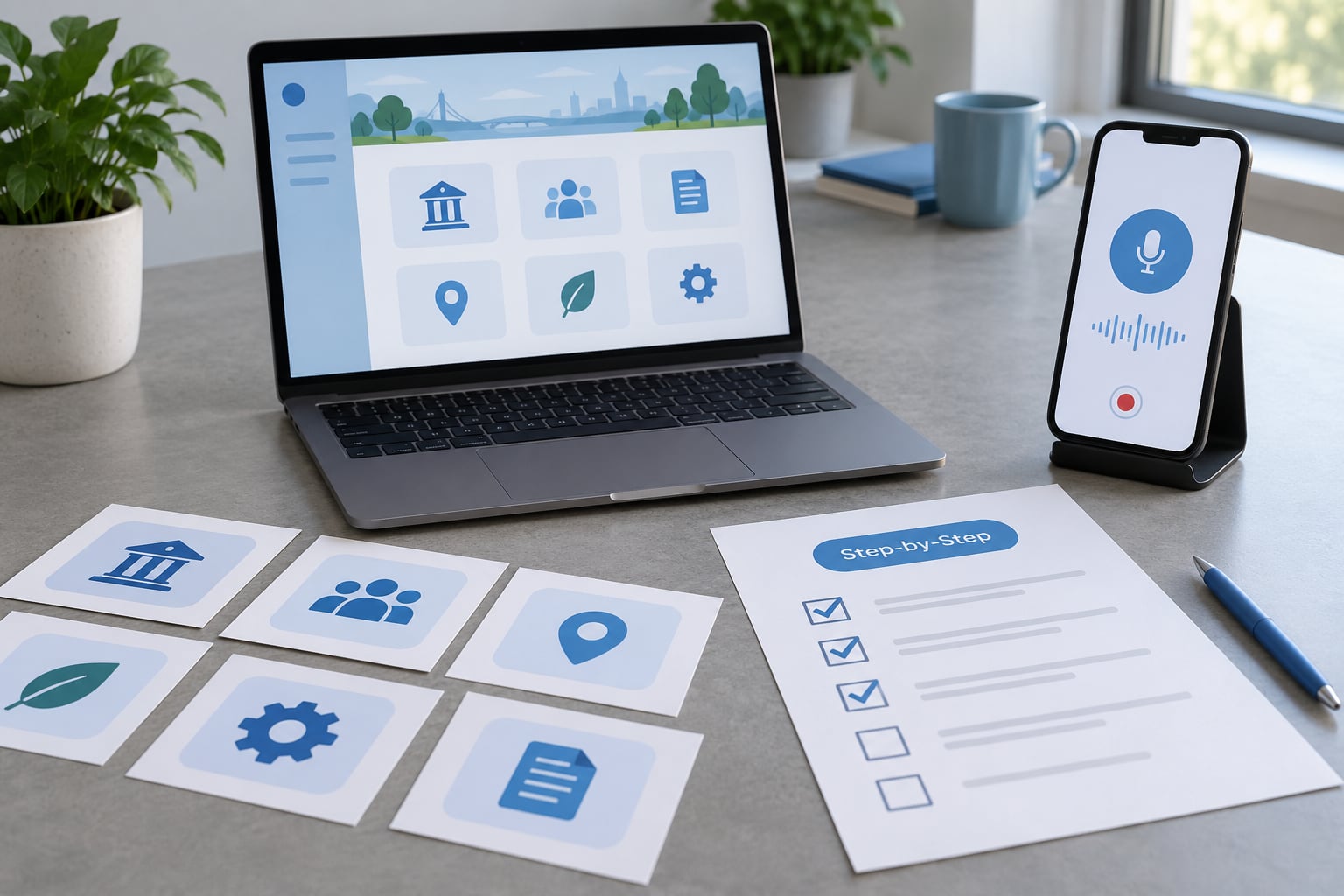
Start With Research, Not Assumptions
Most teams guess wrong about who they are serving. A highly educated doctor in a rural clinic can have low digital literacy while being fully able to read, so you have to research reading ability and device confidence as two separate things.
Document three things during observation: what people call the service in their own words, which parts they repeat back to you unprompted, and where they pause. A pause longer than a few seconds is usually a comprehension failure, not a reading-speed problem.
Recruit participants through trusted local intermediaries, pay a fair incentive, and describe the session in advance in spoken form. Never hand a consent form to someone you are asking to evaluate a written form. Explain it out loud, in their language, and let them agree verbally in front of a facilitator. Record the agreement in your own notes.
How do you tell this stage worked? You can describe your user’s journey better than they could at the start, and you have at least three real sentences of their own wording to reuse in button labels.
Write Short, Direct Instructions
Plain language is a discipline, not a tone of voice. Aim for short sentences, active voice, familiar words, and one idea per instruction. GOV.UK content design has long targeted a reading age of nine for government services, which is a reasonable benchmark even for a small city team.
Replace noun-heavy phrases with verb-led ones. Before: “Submission of application for water connection permit.” After: “Apply for a water connection.”
Cut qualifiers and hedges. “Your application has been received and is currently being processed by the reviewing officer” becomes “We got your application. We will reply in 5 days.”
Error messages earn their keep here. Instead of “Invalid entry”, write what happened and what to do: “Phone number is too short. Add the area code.” Put the message next to the field, in plain words, and keep it on screen until it is fixed rather than letting it vanish after three seconds.
Always keep form labels visible above the input. Placeholder text that disappears when someone starts typing is invisible to the person reviewing the form before submitting, and to anyone who loses their place.
Make the Main Action Obvious
Low literacy and low familiarity with devices both raise cognitive load, and the fix is the same: fewer choices per screen. Show three to five primary actions at the top level and push everything else behind a clearly labelled secondary path.
Name buttons after the action, not the object. “Submit application” becomes “Send”. “Pay” beats “Proceed to payment gateway.” Never ship an icon-only control with no visible label, even if a tooltip exists, because tooltips need a pointer and a pause.
Show progress. A three-step task should display “Step 2 of 3” with the steps drawn as circles or check marks, not as a thin bar that requires reading to interpret.
Preserve context when people go back. Losing everything they typed is the fastest way to lose a first-time user for good, so cache the draft on the device and restore it after any interruption.
Use Images, Audio, and Alternatives Together
Pictures reinforce meaning; they should not be asked to carry it alone. Microsoft’s text-free interface research, validated through hundreds of hours of field work with participants across India, the Philippines and South Africa, found that first-time non-literate users could make real progress when voice, video and graphics worked together.
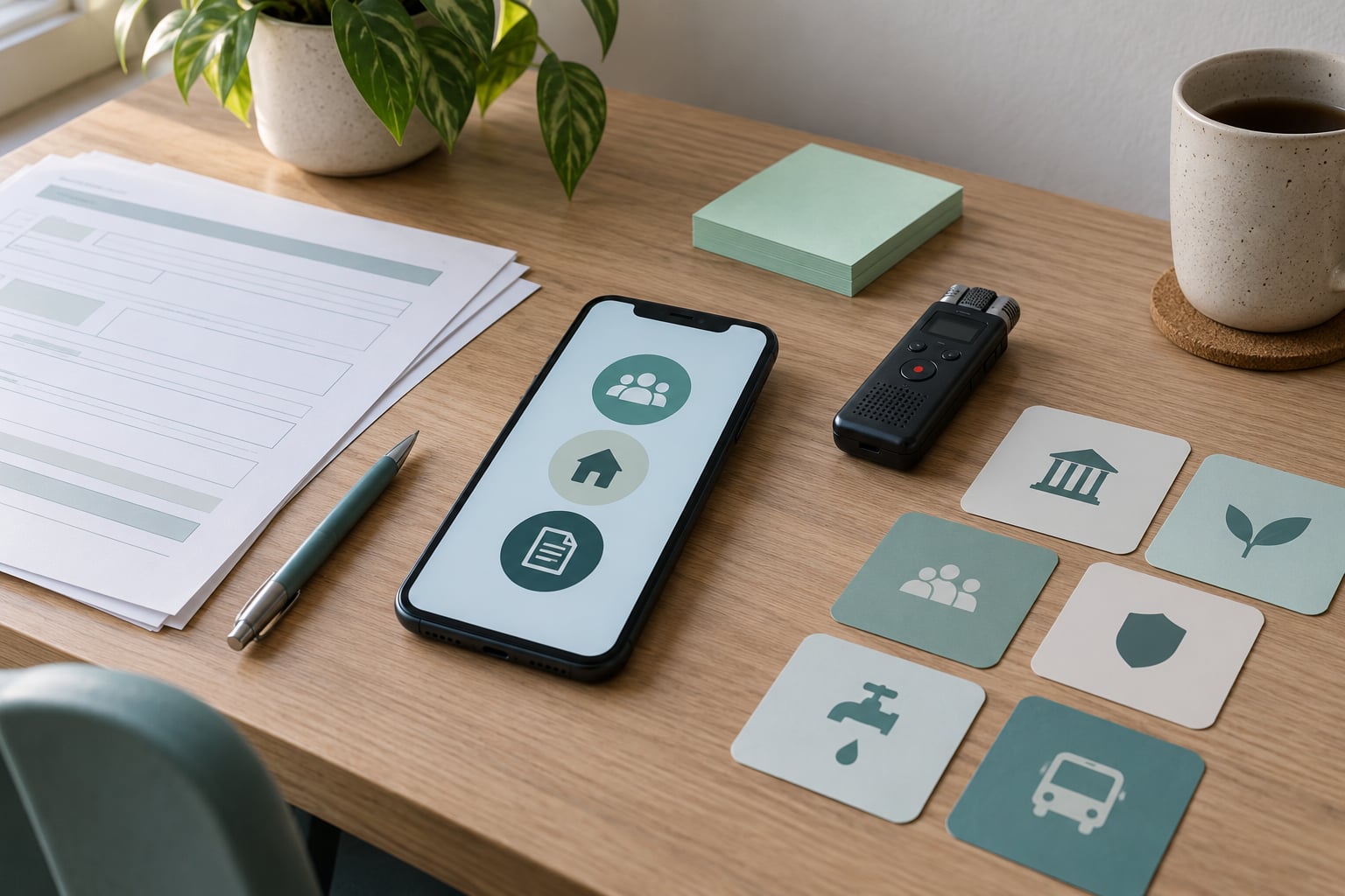
Pair every icon with a short label. Show one photo of the real office or the real document next to the step that mentions it, because recognition beats recall for most people.
Design symbols with local readers. A red cross means medicine in one country and a first-aid kit in another, and an envelope icon means email in cities where it means physical post. Test any symbol you are unsure of before you ship it.
Voice guidance helps, with two caveats. Record audio locally rather than streaming it, so the feature works on a slow or absent connection, and offer a short clip per step instead of a long narration that runs past the screen the user needs. Public Digital has made the sharper point: voice prompts priced as data can exclude exactly the users with the fewest resources.
Test With Real Users and Real Tasks
Give each person one real task, not a hypothetical one. “Report the leaking pipe on your street” beats “find the contact page”. Watch silently, write down every point where they hesitate or ask what a word means, and do not rescue them until the attempt has clearly failed.
Five metrics are enough: task completion, time to complete, errors and backtracks, requests for help, and whether the person says they understood. Ask about confidence at the end, in their own words, because people often complete a task while still being unsure they did it correctly.
Never tell a participant they got something wrong. If someone cannot read, a failed task is a finding about your design, not about their ability. Say “I would like to see what happens next” instead of “you missed that button”.
Prioritise fixes by frequency and severity. If four of six people miss the same control, fix that before polishing anything else, then run the same test again with new participants.
Common Mistakes
Assuming low literacy means low intelligence. Some of your users can reason through a complex form but cannot decode it, because the vocabulary is unfamiliar. Correction: write at a reading level your local reviewer confirms, not at a difficulty level you assume they cannot handle.
Translating instead of localising. A sentence translated word for word carries the same structure and often the same jargon. Correction: rewrite the instruction in the target language from scratch with a speaker of that language, then back-translate to check nothing was lost.
Using jargon and internal department names. “Resident permit variation” means nothing to the person it describes. Correction: use the words people say at the counter, and put the official term in parentheses only where staff need to match records.
Relying on colour alone. Red and green status dots fail for colour-blind users and for people on washed-out screens in daylight. Correction: add a shape, a word, or both to every status indicator.
Hiding help behind an icon in the corner. If assistance is one tap away and invisible, it will not be found. Correction: keep a visible “Call” or “Ask a person” action on every step of a high-stakes flow.
Testing only with staff or volunteers. Colleagues read fluently and already know the process, so they will sail through problems your users will hit. Correction: recruit people outside the organisation who have never used the service.
Measuring aesthetics instead of task success. A clean mockup can still lose the user at step two. Correction: track completion and error rates, not screenshots in a slide deck.
Skipping offline and low-bandwidth behaviour. Interfaces that stall on a slow connection push people back to the counter queue. Correction: cache the essential flow, compress images, and keep text working when images do not load.
Frequently Asked Questions
Is plain language the same as accessible content?
No. Plain language is about sentence length, vocabulary and clarity of instruction. Accessible content is broader: it covers captions, alt text, contrast, headings and assistive-technology support. Plain language helps almost everyone, including sighted, fluent readers in a hurry, while accessible content is a legal and technical requirement. Treat plain language as the easiest and most valuable half of accessibility, then check the technical half separately.
Do icons work better than text for low-literacy users?
Icons work well as reinforcement and poorly as the only label. A familiar symbol paired with a short word speeds recognition, especially for first-time users. An unfamiliar symbol with no label creates a guessing game, and symbols with local meanings can reverse the intended instruction. Test each one with people from the community you are serving before you rely on it.
How do you test a design with users who cannot read?
Give real tasks instead of instructions, describe the session out loud, take verbal consent, and measure completion, time, errors and confidence. Do not correct the participant during the attempt, and do not record a failure as a participant error. Five to eight sessions per round usually surface the same three or four blocking problems, which is enough to act on.
What is the difference between low literacy and low digital literacy?
Low literacy describes reading and writing ability. Low digital literacy describes confidence and skill with devices, networks and software. They overlap often and diverge often. A well-read person may freeze at an unfamiliar app, and someone who cannot read may navigate a photo-based flow perfectly. Research both separately, because the fixes differ: simpler words for one, fewer steps and visible help for the other.
When do voice interfaces help, and when do they fail?
Voice helps when it reads short, spoken instructions in the user’s own language, and when the audio is stored on the device so it works without a data connection. It fails when audio streams from a server, when the recording is long and fast, or when the microphone workflow confuses first-time users. Offer voice alongside pictures and text rather than instead of them.
Conclusion
Designing for low literacy users is a sequence: research real users, rewrite the words, cut the choices, reinforce every symbol with an image or a voice, then test the whole flow with people who reflect the people you serve.
Start with one task. Watch six people complete it, simplify that single flow, and run the same test again in 2026. Everything else can wait for the next round.