Inclusive design matters for public apps because the app is often the only digital route to a service a resident is legally entitled to. When permits, payments, benefits, transit and emergency information sit behind an interface that assumes a fast connection, a recent phone, one language and full dexterity, exclusion stops being an inconvenience and becomes a denied service. Public agencies carry the legal and civic weight that commercial products do not.
That is the whole argument, and it is not a soft one. The rest of this guide covers who gets shut out, what the law now expects from public entities, and what a municipal digital team can actually ship this quarter.
Our team reviews civic app releases the way we review any product build: journeys end to end, on the cheapest device we can find, with the assistive technology switched on. That routine turns up the same failures every time, and they are rarely exotic. A permit portal that demands a six-character password. A parking app whose only map is a pinch-zoom canvas. An alert screen that flashes before it speaks.
Table of Contents
- What does inclusive design mean in a public app?
- Inclusive design and accessible design are not the same thing
- Why inclusive design matters for public apps
- Public entities carry the legal weight that commercial apps do not
- Who can be excluded by an inaccessible public app?
- How can teams make public apps more inclusive?
- What inclusive design practices work in civic apps?
- Design for the device and connection people actually have
- Offer more than one channel, always
- Use plain language throughout the flow
- Design the kiosk, the shared screen and the alerting flow separately
- Support assisted digital service as part of the product
- Test with a range of participants, not a token one
- How do inclusive public apps benefit residents and city teams?
- How can teams measure whether a public app is inclusive?
- Measures that describe real use
- The testing stack
- What mistakes can undermine inclusive design?
- Frequently Asked Questions
- What is inclusive design?
- What is the difference between inclusive design and accessible design?
- Why is accessibility important for government services?
- Is inclusive design required by law for public apps?
- What accessibility testing tools should public sector teams use?
- How do you make a public sector app accessible in practice?
- Conclusion
What does inclusive design mean in a public app?
Inclusive design means building the service so that residents with disabilities, older adults, people with limited digital skills, and people facing language or connectivity barriers can finish the same task as everyone else, without needing a special arrangement or an exception granted by staff.
For a civic app that means the permit application, the bus arrival board and the benefits renewal all work for the resident using a screen reader on an old Android phone at the end of a month with limited data. It also means the counter at the service centre still functions, because a well-designed app is not treated as the only route to the service.
Inclusive design and accessible design are not the same thing
Accessible design asks whether a product meets a defined standard of conformance, usually measured against the Web Content Accessibility Guidelines. Inclusive design asks a wider question: who is still unable to do the thing, and why. One is a compliance check with a pass mark. The other is a research method that keeps running after launch.
| Dimension | Inclusive design | Accessible design |
|---|---|---|
| Core objective | Make the service usable by the widest possible public, including people who are not covered by a disability definition | Meet a technical standard such as WCAG 2.2 Level AA |
| Method | Research, co-design and iteration with the people affected | Audit against success criteria, then remediate |
| Timing | Starts at discovery, before screens exist | Often applied during build or after a complaint |
| Scope | Language, literacy, connectivity, device age, trust, cost of data, time pressure | Perceivability, operability, understandability, robustness |
| Who gives feedback | Residents, frontline staff, disability advisers, call-centre agents | Automated tools plus specialist auditors |
| Success looks like | Completion rates at parity across groups, fewer repeat visits, fewer assisted completions | A conformance statement and a low defect count |
A screen-reader audit finds roughly four kinds of defect. It will never tell you that the form asks for a date in a format no resident recognises, or that the only language offered is English on a council serving a neighbourhood where a third of households speak another language at home.
Why inclusive design matters for public apps
Because exclusion in a public app is a service failure with a measurable cost. Every barrier adds a phone call, a repeat trip to a counter, an abandoned application or a missed deadline that nobody can appeal, because the person never reached the point where a decision was made.
The consequences stack up:
- Service delivery fails quietly. A resident who cannot complete a renewal online eventually becomes a phone queue, then a caseworker, then an overtime cost. The work does not disappear; it changes shape and moves somewhere you do not measure.
- Trust erodes. People who are repeatedly blocked stop believing the online channel is meant for them, and that belief transfers to the agency itself.
- Deadlines bite hardest. A missed permit renewal or an unreported water leak carries a penalty. The resident who faced a screen reader bug gets fined for a barrier the city built.
- Reuse compounds the problem. A design system with inaccessible components spreads the defect into every product built on it, so the same error appears in parking, libraries and waste collection.
Public entities carry the legal weight that commercial apps do not
Accessibility is a marketing item for a retailer and a legal obligation for a public body. In the United States, Title II of the Americans with Disabilities Act applies to state and local government services, including their websites and apps, and the Department of Justice rule on web and mobile app accessibility sets the compliance expectation for those entities. Section 508 applies to federal agencies and to anything they procure. The United Kingdom works through the Equality Act and the Public Sector Bodies (Websites and Mobile Applications) Accessibility Regulations. In the European Union the European Accessibility Act has applied to covered digital services since June 2025.
WCAG 2.2 Level AA is the common technical reference point across all of them. Note the direction of travel: the obligations are not a background risk to schedule later, they are a condition of running the service.
| Framework | Who it covers | What it asks for |
|---|---|---|
| ADA Title II | US state and local government services | Accessible web and mobile experiences for people with disabilities |
| DOJ web and mobile app accessibility rule | US state and local entities | A stated technical standard, typically WCAG 2.2 AA, plus a conformance record |
| Section 508 | US federal agencies and their suppliers | Accessibility built into procurement, not bolted on afterwards |
| Public Sector Bodies Accessibility Regulations (UK) | UK public sector websites and apps | Public Sector Bodies Accessibility Standard, aligned to WCAG |
| European Accessibility Act | Covered digital services in the EU | Accessibility requirements applying across member states |
| WCAG 2.2 AA | The technical reference most frameworks point to | Testable criteria for contrast, keyboard use, names and descriptions, motion and reflow |
Two figures keep coming up in this conversation. The World Health Organization reported more than two billion people living with vision impairment in 2023. EY, writing in 2025, put the number of people worldwide living with a disability above one billion, more than one in five of the global population. Neither number is about your service specifically. Both describe people already using it.
Who can be excluded by an inaccessible public app?
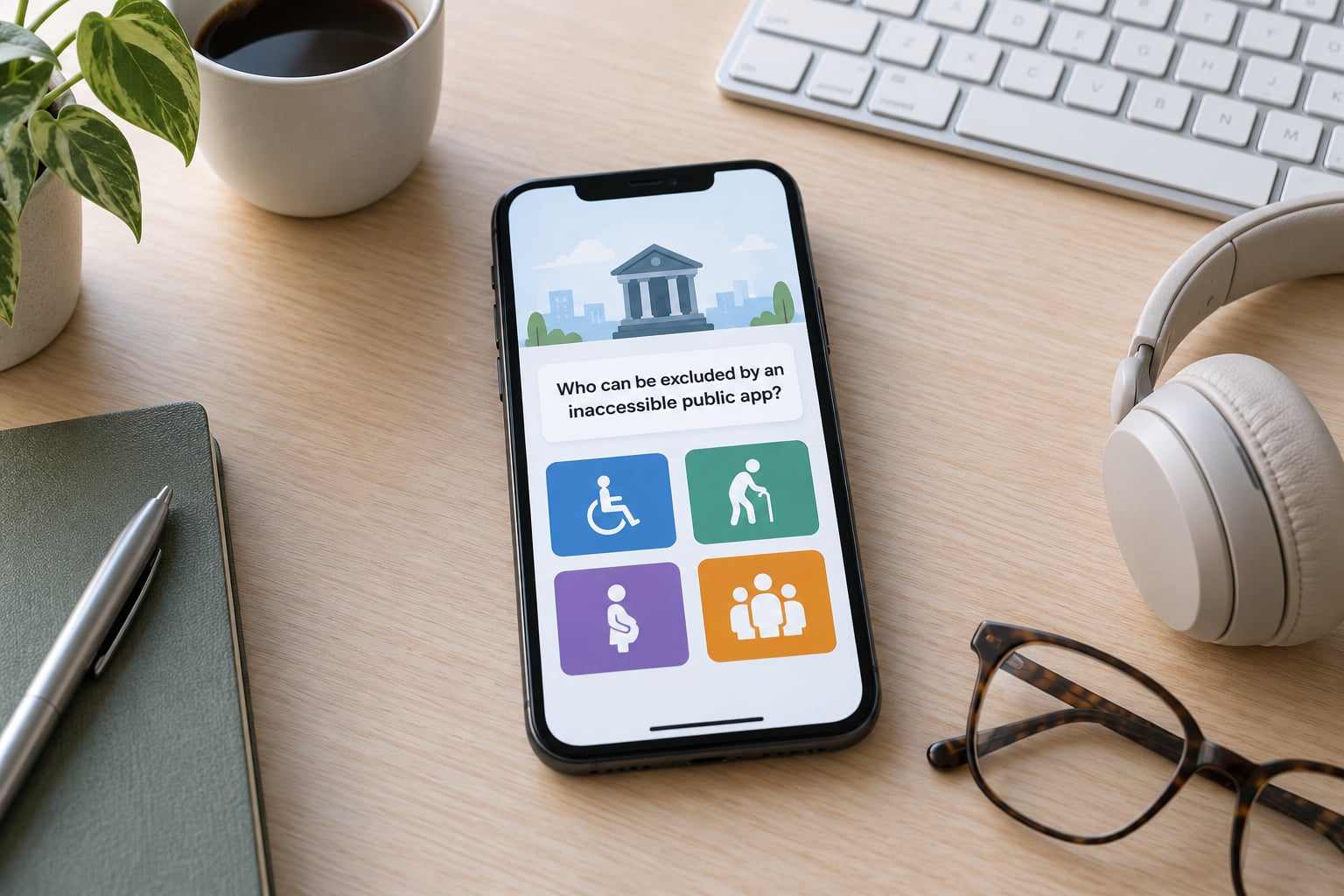
Everyone, in different ways, and more than one group at a time. The groups that public teams most often design past are:
- Blind and low-vision residents. Blocked by map interfaces that only exist as images, by captions missing on video, by icon buttons with no accessible name, and by text that reflows into two-character columns on a small screen.
- Deaf and hard-of-hearing users. Cut off when an alert is audio-only, a video has no captions, or a live voice line carries no text alternative.
- People with motor and dexterity impairments. Blocked by drag-and-drop only interactions, targets under roughly 44 pixels, hover-dependent menus, gestures with no button equivalent, and timeouts that fire before a switch user can respond.
- Older adults. Losing precision, contrast tolerance and confidence, often on a device several years old with limited storage and no budget for a new one.
- People with dyslexia, ADHD or other cognitive differences. Struggling with dense paragraphs, moving text, unexplained jargon, countdown timers and multi-step forms that hide the progress.
- People with photosensitive epilepsy. At risk from an alert screen that flashes before it communicates anything.
- Non-native speakers and residents with limited literacy. Blocked by a single-language interface, by legal and technical wording, or by a translated form that still pushes errors into English.
- Residents on old hardware or weak connections. Locked out when the app assumes a current model, a stable connection or unlimited data, in places where mobile data is a real household expense.
- People with low digital confidence. Blocked by jargon, irreversible actions without confirmation, and an error message that says the wrong thing, for example telling someone their date of birth is invalid because the field wanted day first.
Add a shared family phone, a library computer, or a transit hall kiosk and the overlap gets larger. Someone using a public device has no keyboard autofill, no saved password and no second chance at an error message.
How can teams make public apps more inclusive?
You cannot retrofit inclusion at the end, so the process has to run from discovery. Eight steps cover most of what works in a municipal setting.
- Recruit research participants who are actually blocked. Put the recruitment ask through disability advisory groups, senior centres, libraries and language schools. Pay people for their time; unpaid testing skews toward the confident and the available.
- Map the full journey before the screens. Include the entry point, the authentication step, the failure path, the confirmation and the offline case. Most defects live at the joins.
- Write accessibility into the requirement, not the backlog. WCAG 2.2 AA conformance named in the story, the acceptance criteria and the vendor contract, with the conformance statement required at handover.
- Use plain language and define the terms. Replace jargon with what people actually say at the counter. Front-load the one sentence that explains what this step does.
- Build flexible input paths. Offer more than one way to complete a task: keyboard and switch access, a phone number, an in-person counter, a downloadable form that can be printed and returned.
- Localise content, not just strings. Translate the errors and the confirmation messages too, and check that the translated layout does not break.
- Test with assistive technology early and often. A real screen reader pass on the working prototype, with the people who use that technology daily.
- Keep an open feedback route. A published reporting address for barriers, with a named owner and a published fix date.
The order matters. Steps three through six are where most teams spend their effort, and they are the steps that quietly get cut when a release date moves.
What inclusive design practices work in civic apps?
These are the practices that have survived contact with real service desks.
Design for the device and connection people actually have
Test on hardware from the last four years, not the current flagship, and on the second-best network in the building rather than the office fibre. Keep the first useful screen under a couple of hundred kilobytes so the app degrades gracefully rather than stalling. Where a resident has a weak signal, show what is cached, say plainly that the update has not gone through, and give them a reference number that works by phone.
Offer more than one channel, always
Accessibility and channel choice are the same investment. A permit app that also accepts a photo of a form by email, or a phone call that a staff member completes with the resident, captures people who could never have finished the online flow. Libraries, benefits offices and transit agencies all see the same pattern: the digital channel handles straightforward cases, and the assisted channel absorbs everything that got stuck.
Use plain language throughout the flow
Plain language is an inclusion lever with an accessibility payoff. Shorter sentences, common words, active voice and a clear subject reduce reading load for people with dyslexia, cognitive disabilities and limited English, and they reduce call volume for everyone else.
Design the kiosk, the shared screen and the alerting flow separately
A kiosk needs a session timeout that warns before it ends, a reset that clears personal data, keyboard and screen-reader access, and a height-reachable keypad. A transit platform display needs to work in glare, rain and at a distance. An emergency alert needs to be visual and audible at once, never to rely on colour or motion alone, and never to flash without a plain-text alternative.
Support assisted digital service as part of the product
Frontline staff and library digital helpers need the same access as residents, plus a way to complete a transaction on someone’s behalf with consent recorded. Budget for that training and for the accessibility officer who owns the standard. A named owner is the difference between a standard and a hope.
Test with a range of participants, not a token one
One wheelchair user in a five-person session tells you about clear space and reach. It tells you nothing about screen reader flows, captions, plain language or low-bandwidth behaviour. Build the sessions to cover distinct needs, and treat the accessibility community’s repeated point that this should be designed with people rather than designed for them as a practical instruction rather than a slogan.
How do inclusive public apps benefit residents and city teams?
The benefits show up as fewer assisted contacts, fewer repeat journeys and fewer defects in production. Look at a service where the redesign was done properly and the pattern is consistent.
- Transit arrivals. An arrival app rebuilt with semantic markup, text-first status and a screen-reader tested route planner serves blind commuters, tourists with no data plan and older riders in the same release. The station staff see fewer “which platform” questions.
- Benefits renewal. A renewal flow cut from a dense multi-page form to a short plain-language sequence, with a save-and-return option and an offline reference, raises self-completion and shrinks the phone queue around deadline week.
- Permits and licensing. A portal with an accessible document upload that announces file type and size, keyboard-reachable date fields and a status page in plain language removes the most common reasons a case stalls in review.
- Parks and recreation. Facility listings that work under a tree canopy on a mid-range phone, with alt text on trail maps, reach families who never open the app on good signal.
- Emergency information. Alerts delivered as text, sound and vibration together, with a language-matched version, reach far more of the public than a single-channel broadcast.
| Measure | Non-inclusive service | Inclusive service |
|---|---|---|
| Task completion by cohort | Large gap between general users and disabled, older or low-digital-confidence users | Completion rates broadly at parity across groups |
| Assisted contacts per 1,000 requests | High, and rising with each release | Falling, because the digital channel absorbs more cases |
| Repeat journeys | Residents return to the counter to finish what the app started | Most requests finish in one session |
| Defects found before launch | Most accessibility defects found in production | Majority found in testing and co-design sessions |
| Compliance evidence | Assembled under pressure after a complaint | Published conformance statement plus a dated audit trail |
| Exposure | Complaint, ombudsman escalation, settlement | Documented evidence of reasonable steps |
For city teams the second-order effect is bigger than the first. An accessible component in a design system, checked once and reused everywhere, turns a citywide compliance obligation into a routine pull request.
How can teams measure whether a public app is inclusive?
You cannot improve what you do not count, and a conformance score on its own tells you very little about whether residents succeeded. Track both.
Measures that describe real use
- Completion rate by group. Break the rate down by assistive technology in use, device age, browser, language and neighbourhood. A single blended number hides the only thing you care about.
- Parity between cohorts. Set a target where the completion gap between the general population and disabled or older users stays within a few percentage points.
- Abandonment points by step. The step where people leave is usually the step that is broken.
- Accessibility defect rate. Count defects per release, with severity weighting, and publish the trend.
- Assisted digital contacts. Track how often a transaction ends at the counter, and read those cases for the reason it happened.
- Language and device coverage. Which languages are complete rather than partially translated, and what share of sessions run on older hardware.
- Support request themes. Categories, not just volume, so the same barrier does not generate the same call for a year.
- Trust signals. Short resident surveys after a completed task, plus the qualitative feedback that arrives from advisory groups.
The testing stack
Automated tools such as Axe, Wave and Lighthouse catch roughly the machine-detectable share of issues, which makes them a good nightly gate in continuous integration. They cannot tell you whether focus order makes sense, whether an alt text description is accurate, or whether the error message helps. Pair them with manual passes: keyboard-only navigation, a real screen reader such as NVDA, JAWS or VoiceOver, a zoom and reflow check at 200 percent, a contrast check against the 4.5:1 ratio for body text, and captions on every video.
Treat every automated pass as necessary and nowhere near sufficient. Teams that report a clean automated scan and nothing else are reporting the number their tool could see.
What mistakes can undermine inclusive design?
- Saving accessibility for the final audit. An audit after launch finds defects and nothing else. The fix is to put conformance criteria into the requirement, so a defect never reaches the acceptance stage.
- Designing for an average user who does not exist. The composite persona is a mid-thirties smartphone owner on fast broadband. Test with the edges, because that is where the volume of public service contact comes from.
- Shipping one language and calling it done. Partial translation is worse than none, because the failure lands at the error message. Complete the whole flow, including errors and confirmations.
- Excluding residents from the research. Asking staff what residents find difficult produces a second-hand list of assumptions. Recruit participants through the groups they already use, and pay them.
- Measuring success without asking who finished. A completion rate of 80 percent looks healthy until you learn that the missing 20 percent is concentrated in one neighbourhood and one assistive technology.
- Treating the app as the only channel. Removing the phone option to save money simply relocates the cost to staff time and missed deadlines.
- Assuming the design system is finished. New components ship faster than accessibility review. Require the check on the component, not on the finished product.
None of these are failures of intention. They are what happens when inclusion has no owner, no budget line and no acceptance criteria.
Frequently Asked Questions
What is inclusive design?
Inclusive design is the practice of building a service so that people with disabilities, older adults, people with limited digital skills, and people facing language or connectivity barriers can complete the same tasks as everyone else. It goes beyond accessibility conformance by covering language, literacy, device age, data cost and trust, and by testing with the people affected rather than about them.
What is the difference between inclusive design and accessible design?
Accessible design measures a product against a technical standard, usually WCAG 2.2 Level AA, and produces a pass or fail result. Inclusive design asks the wider question of who still cannot complete the task and why, using research and co-design that start before screens are drawn. Accessibility is a floor inside inclusive design, not a substitute for it.
Why is accessibility important for government services?
Accessibility is important for public services because the digital channel is often the only way to reach a service a resident is entitled to. A blocked renewal, permit or alert is a denied service rather than an inconvenience, and it falls hardest on people with the least time and money to spare. Exclusion also moves cost into call centres and counters and creates legal exposure.
Is inclusive design required by law for public apps?
Public bodies carry formal obligations where commercial firms often do not. In the US, ADA Title II and the Department of Justice web and mobile app accessibility rule apply to state and local government, and Section 508 applies to federal agencies and their suppliers. UK public bodies follow the Equality Act and the Public Sector Bodies Accessibility Regulations. In the EU, the European Accessibility Act has applied to covered digital services since June 2025.
What accessibility testing tools should public sector teams use?
Use automated tools such as Axe, Wave and Lighthouse as a continuous integration gate, because they catch machine-detectable defects cheaply on every release. Pair them with manual testing: keyboard-only navigation, a real screen reader such as NVDA, JAWS or VoiceOver, reflow checks at 200 percent zoom, contrast verification against 4.5:1 for body text, and captions on all video.
How do you make a public sector app accessible in practice?
Recruit participants who are currently blocked, map the journey including authentication and failure paths, write WCAG 2.2 AA criteria into requirements and vendor contracts, use plain language, provide more than one input channel, localise errors as well as labels, test with assistive technology on the prototype, and keep a published route for reporting barriers with a named owner and a fix date.
Conclusion
Start with the people the service currently fails. Pull the completion data, break it down by assistive technology, device age, language and neighbourhood, and look at where the gaps sit. Then walk the journey yourself on the oldest phone in the building with a screen reader running, and invite the residents who reported barriers into the next round of design rather than the next complaint.
Inclusive design matters for public apps because access to a civic service is not a feature of the app. It is the app.