
The fastest way to choose a chart type for your data is to write down the question you need answered first, then pick the chart whose visual encoding matches it. Comparing categories calls for bars, change over time calls for a line, a relationship calls for a scatter plot, and a spread of values calls for a histogram or box plot.
Most people get stuck on the opposite problem. They open a spreadsheet, scroll past forty chart options, and try to reverse-engineer which one their data might fit. That is backwards, and it is why the same datasets keep getting presented as pie charts of twelve slices.
The eight steps below take about fifteen minutes on a small dataset. They work whether you are building a slide for a council meeting, a panel on a public dashboard, or a chart inside a Python notebook.
Table of Contents
- What You Need
- Step-by-Step
- 1. Start with the question the chart must answer
- 2. Identify the data structure and encoding
- 3. Match the analytical goal to a chart family
- 4. Choose the simplest chart that fits
- 5. Design the encodings for accurate reading
- 6. Adapt the chart to the audience and medium
- 7. Test readability and interpretation
- 8. Validate against alternatives
- Common Mistakes
- Quick Tips for Better Chart Choices
- Frequently Asked Questions
- What is the easiest way to choose the right chart type?
- Should I use a bar chart or a line chart?
- What is the best chart for showing a distribution?
- How do I choose colors for a data visualization?
- When is a pie chart appropriate?
- How many data points should a chart display?
- Conclusion
What You Need
Before you choose anything, get five things straight. Each one takes a minute, and each one narrows the field dramatically.
- A defined audience. Who reads this? A city council, an executive, your own team, or the public. The audience decides how much annotation and how many series you can afford.
- A decision or question. One sentence, phrased as a question. If you cannot write it, you do not have a chart yet.
- A cleaned dataset. Missing values resolved, duplicates removed, units consistent. Charting tools will happily plot nonsense without warning you.
- The data types of each column. Categorical, temporal, numeric, geographic, hierarchical. This is step 2 and it does most of the narrowing.
- One prioritized insight. The single thing you want a reader to take away if they look for five seconds.
No specialist software is required to work through this. A spreadsheet will do for the analysis and for a first chart, and a visualization tool such as Tableau, Power BI, Flourish or a Python library handles the rendering once you know what you want.
Step-by-Step
1. Start with the question the chart must answer
A vague request to display data is not a question. Rewrite it until it names a comparison, a period, and a unit.
Turn “show our service requests” into “which ward generated the most 311 requests per 1,000 residents in the last quarter?” That version immediately implies a ranked bar chart with a normalized denominator. Turn “show transit usage” into “how has weekday boardings on the three busiest routes changed since the fare change?” and you have a line chart with a known event to annotate.
Write the question as a fill-in-the-blank: How has [metric] changed over [time]? Which [categories] have the highest [measure]? What share of [total] belongs to [group]? Are [variable A] and [variable B] related? How wide is the spread of [value] across [population]? Those five shapes cover most analytical work.
2. Identify the data structure and encoding
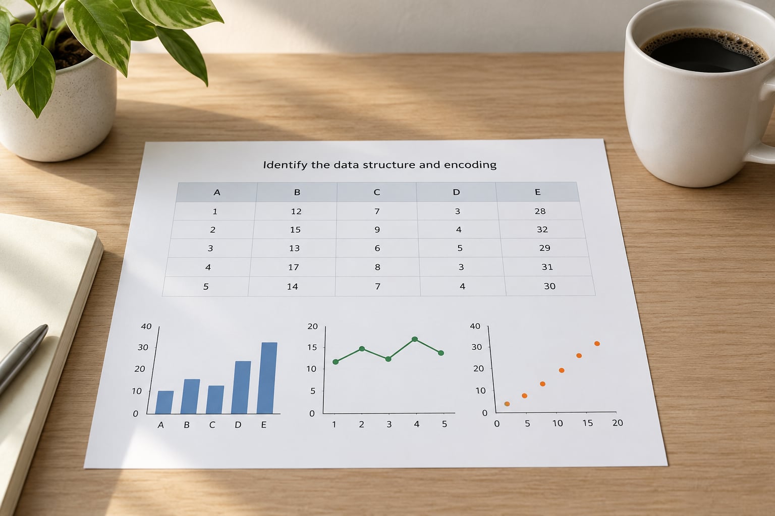
Classify each variable before you classify anything else. Categorical data has labels and no inherent order, like ward names or vehicle types. Ordinal data has an order but uneven gaps, like satisfaction ratings. Temporal data is a timestamp with a real interval. Numeric data is a measured quantity. Geographic data carries coordinates or a place name, and hierarchical data nests, like a budget line inside a department inside a city.
Then check what each value actually is. A count of 42 requests and a rate of 18 per 1,000 residents are both numbers, but only one of them can be compared across districts of different sizes. Percentages that do not add to 100 are not part-to-whole data, no matter how many columns they have.
Match the variable to the visual channel a human reads most accurately. Position on a common scale is the most accurate channel, then length, then angle, and area is the weakest. This ordering is why bar charts and scatter plots hold up and pie charts do not.
3. Match the analytical goal to a chart family
Here is the compact decision guide. Find the question you wrote, then take the chart family next to it.
- Comparing values across categories → bar chart. Sort it descending unless the categories have a natural order.
- Change over time → line chart. Use regular intervals on the axis, always.
- Relationship between two numeric variables → scatter plot. Add a trend line once there are more than about 30 points.
- Distribution of one numeric variable → histogram for shape, box plot when you need spread and outliers across groups.
- Part-to-whole composition → stacked bar chart, treemap for many parts, pie chart only past two or three slices.
- Spatial pattern → choropleth map for rates, symbol map for counts, density map for clustering.
- Flow or movement between stages → Sankey diagram, or a funnel for a drop-off process.
- Performance against a target → bullet chart, or a bar chart with a reference line.
- A single number → a KPI tile with the value, its unit and the comparison period. No chart at all.
The question wins every argument. If you prefer a particular look, that preference picks the styling inside a family, never the family itself.
4. Choose the simplest chart that fits
Within a family, several variants solve different problems. Pick the one that carries the least decoration for the job.
- Bars: grouped shows each series side by side, stacked shows a total broken into parts, and 100% stacked shows share of total. Grouped wins for direct comparison, stacked wins for total volume, 100% stacked wins when the total differs but the mix matters.
- Lines: multiple lines work up to about four series. Past that, switch to small multiples, one mini chart per series on a shared axis. Indexed lines, rebased to 100 at the start, let you compare growth rates when the absolute levels differ wildly.
- Scatter: plain scatter shows every point. A connected scatter plot works when the x-axis is ordered and the sequence matters, such as months in order. A bubble chart adds a third variable as size, and size is a poor channel, so use it only when the third variable is genuinely important.
- Distribution: a histogram groups continuous values into bins and shows shape. A box plot compresses the same data into median, quartiles and outliers, which is why it wins for group comparison and loses for shape detail.
A specialised chart earns its complexity only when a plain one genuinely fails. A box plot beats five overlapping histograms. A Sankey beats a paragraph describing movement between stages. A bullet chart beats a bar chart plus a target line plus an annotation.
The most common mix-up is bar chart against histogram. A bar chart puts gaps between bars because the categories are discrete. A histogram has touching bars because the values are continuous and the bins are ranges. If you can shuffle the categories and nothing breaks, it is a bar chart.
5. Design the encodings for accurate reading
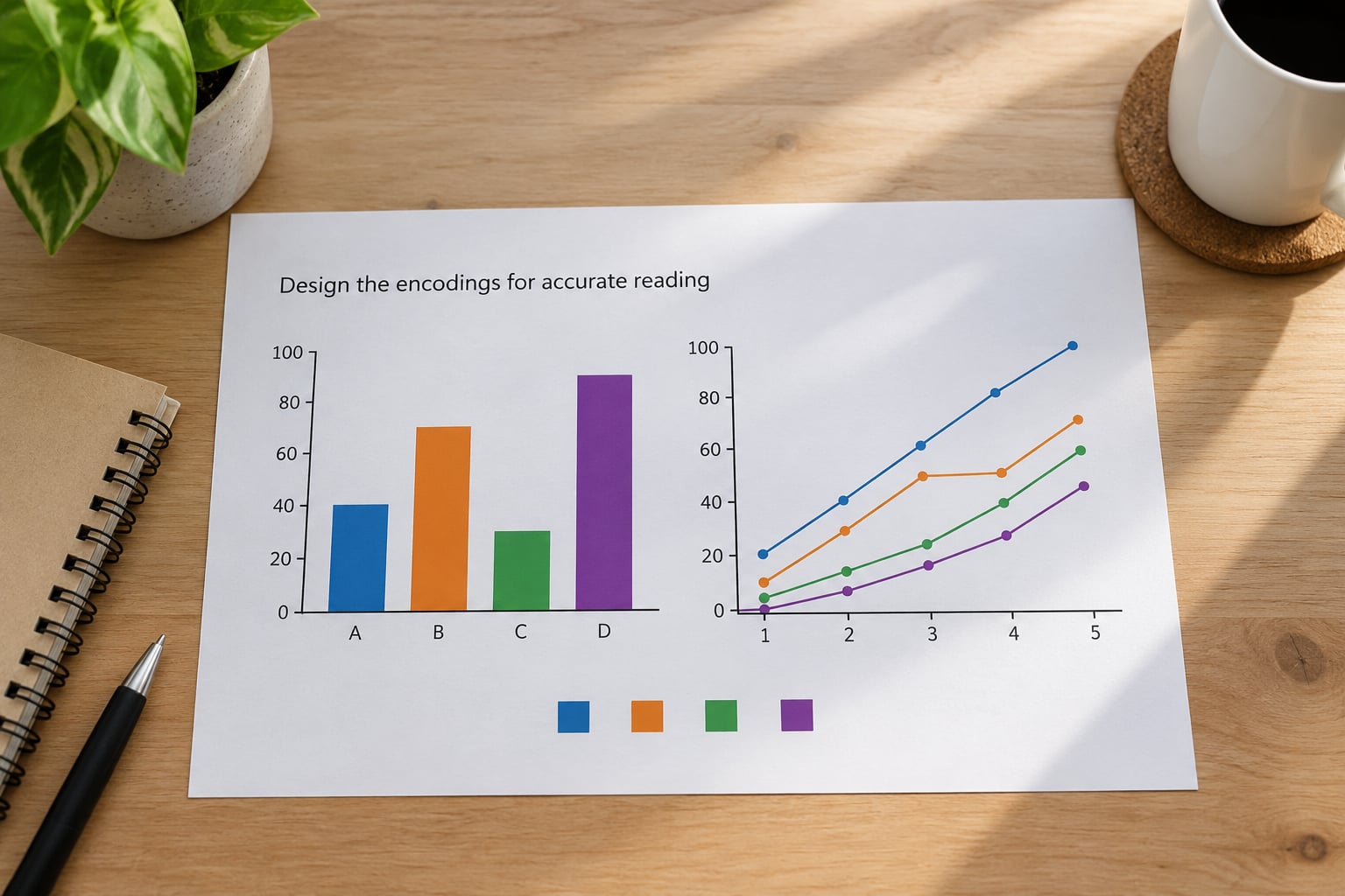
The chart type is roughly half the work. The other half is making sure the reader measures what you intended.
- Baselines. Bars start at zero. Lines may use a non-zero baseline, but label the break so nobody reads a small change as a collapse.
- Axes and intervals. Label both axes with units. A line chart with uneven time spacing is the single most misleading chart in circulation, because the line implies a rate the data does not support.
- Sorting. Sort bars by value. Sorting by alphabet makes readers hunt.
- Labels. Put the value on the bar or line end when there are few enough to read. Axis ticks alone force people to estimate.
- Colour. Colour should carry meaning, such as a highlighted series against grey context. Every extra hue is a legend the reader has to learn. Check for contrast and do not rely on colour alone; pair it with a label or a pattern.
- Annotation. One short note on the anomaly that matters beats three decorative callouts.
Three distortions cause most of the misleading charts people complain about: a truncated bar axis, a dual axis scaled so two unrelated series appear to cross, and a 3D effect that gives the nearest bar a taller perspective than the one behind it. Drop the dual axis, start the bars at zero, and keep everything flat.
6. Adapt the chart to the audience and medium
The same data needs different charts depending on where it will be read.
- Executive summary or slide. One message, one chart. Horizontal bars if labels are long, and a direct title that states the finding rather than naming the metric.
- Dashboard panel. Small multiples of the same measure across identical scales beat one chart with a filter dropdown, because comparison across panels is the point.
- Mobile screen. About 30 bars is the practical ceiling on a phone. Vertical columns break down at that width; horizontal bars grow downward and stay readable. Keep legends outside the plot area.
- Print or PDF report. Assume greyscale printing may happen. Use line styles and markers as well as colour, and set the figure size for the page rather than the screen.
- Public-facing civic page. Assume a non-specialist reader with a small screen and about eight seconds. Chart labels should read as plain sentences and every rate needs its denominator shown.
Accessibility narrows the field too. Never encode a series with red and green alone, since roughly one in twelve men has a red-green colour vision deficiency. Blue and orange, or one hue with varying lightness, works for most cases. Add alt text that names the chart type and the finding, not just the picture.
7. Test readability and interpretation
Run a five-second test on a real viewer. Show the chart without explanation for five seconds, then ask one question: what is the main thing this chart is telling me?
If their answer matches yours, the chart is doing its job. If they say “I do not know”, the title, the sorting or the colour is doing too much work. In practice this test catches most unreadable dashboards faster than any checklist.
Then strip it back. Remove gridlines that are not carrying data, remove the legend entry for a series you have labelled directly, remove any element you cannot justify in one sentence. Repeat until you cannot remove anything more without losing meaning. That stopping point is usually about a third lighter than where you started.
Preview at the actual size it will be displayed. A chart that reads fine full-screen on a laptop is unreadable in a dashboard tile, and dashboard tiles are where most charts actually live.
8. Validate against alternatives
Pick one reasonable alternative chart and build it too. Often the second version answers the question more cleanly, and finding that out ten minutes late is far cheaper than finding it out after publication.
Work through three checks. Does the conclusion change between the two charts? If the same message survives either way, choose the simpler one. Is anything misleading in either version, such as a scale that exaggerates the gap? And does one version require an explanation that the other does not?
For anything a team or a public audience will see, write a short decision note: the question, the data type, the chart chosen, the alternatives rejected and why. It takes two minutes and it stops the same debate from restarting every quarter. It also makes handover to whoever maintains the dashboard later far less painful.
Common Mistakes
These are the errors that show up most often, each with the fix that corrects it.
- Choosing by appearance first. Picking the chart that looks good, then searching for data to justify it. Fix: write the question before opening any chart menu.
- Pie charts with too many categories. Beyond two or three slices, human angle comparison fails and the chart becomes decoration. Fix: switch to a sorted bar chart, or a 100% stacked bar when the total varies.
- Plotting rates as if they were counts. A raw count chart makes a dense district look like the worst performer. Fix: normalise by population and put the denominator in the axis label.
- Truncating the bar axis. A 40 to 45 range makes two values look ten times apart. Fix: bars always start at zero; if you need to zoom, use a line chart or a dot plot instead.
- Connecting unordered categories. A line drawn across product names or ward numbers implies a sequence that does not exist. Fix: dots or bars for categories, lines only for genuine time or ordered sequences.
- Using colour without meaning. A rainbow palette where every bar is a different colour adds no information. Fix: one hue for the data, a second for the highlight, grey for context.
- Decorating the chart. Drop shadows, gradients, 3D bars, background images and legends for a single series. Fix: delete everything you cannot justify; every mark costs attention.
There is also a case where no chart is right. A single KPI with a comparison to the same period last year belongs in a tile, not a chart. A list of twelve rows with six columns each is a table. A download link is honest when the audience wants the detail themselves.
Quick Tips for Better Chart Choices
Write the takeaway first. One sentence describing what the reader should conclude. If the sentence does not name a direction or a magnitude, the chart is not ready.
Put the finding in the title. “Falls concentrated in two wards” beats “Falls by ward, year over year.” Readers scan titles, and a descriptive title lets them skip everything else.
Annotate the anomaly, not the average. A short note on the sharp drop caused by a service change is worth more than a grid of reference lines.
Keep bar baselines at zero and line intervals regular. These two rules prevent more bad charts than every other rule combined.
Show uncertainty where it matters. For survey data or modelled estimates, add confidence bands or an error bar. A point estimate alone implies a precision you may not have.
Choose accessible colour deliberately. Pick from a colourblind-safe palette, test the chart in greyscale, and confirm that no two important series differ only by hue.
Match the tool to the question, not the other way round. Every one of Excel, Google Sheets, Tableau, Power BI and Python can produce every chart on this page. The right tool is the one that lets you export the format and size you need for the audience in front of you.
Frequently Asked Questions
What is the easiest way to choose the right chart type?
Start with the question, not the chart list. Write one sentence describing what the reader must understand, then match it: comparison across categories means a bar chart, change over time means a line chart, a relationship between two numbers means a scatter plot, and the spread of one number means a histogram or box plot. Choosing from a menu of chart types first, then hunting for data to fit, is the most common reason people end up with the wrong visual.
Should I use a bar chart or a line chart?
Use a bar chart when the categories have no real sequence, such as departments or product lines, because bar length is easy to compare. Use a line chart when the x-axis is a continuous, evenly spaced sequence, usually time, because the connecting line shows direction and rate of change. If your categories could be shuffled without breaking anything, it is a bar chart even when the categories happen to be months.
What is the best chart for showing a distribution?
A histogram shows the shape of one continuous variable, with values grouped into bins and touching bars. A box plot shows the same data more compactly as median, quartiles and outliers, which makes it the better choice when you are comparing distributions across several groups. Use a histogram when the shape itself matters, and box plots when the comparison matters more than the shape.
How do I choose colors for a data visualization?
Use colour to carry meaning rather than to decorate. One hue for the main data, a second accent for the series or bar you are highlighting, and grey for everything else. Avoid red and green as the only distinction, since a large share of men cannot separate them. Keep the palette small, check the chart in greyscale, and pair any colour-only distinction with a label, marker or line style.
When is a pie chart appropriate?
A pie chart works when the whole is meaningful, the parts add up to that whole, and there are only two or three slices that need comparing. Past three slices, people struggle to judge angles and the chart stops communicating. When the total varies across groups, a 100% stacked bar communicates the same share comparison far more accurately. For a single proportion, a KPI tile is usually clearer than either.
How many data points should a chart display?
For bars, roughly fifteen categories is the practical limit before sorting and labelling become a problem; around thirty is the ceiling on a phone screen. For scatter plots, a few hundred points still read well if you use transparency, and a trend line becomes useful past about thirty. For lines, keep to about four series and switch to small multiples beyond that, or the chart turns into spaghetti.
Conclusion
Choosing a chart type is a four-step decision that takes minutes once you know the order. Define the question your chart must answer, identify whether each variable is categorical, temporal, numeric or geographic, select the chart family that matches the analytical goal, then simplify the design until only what carries meaning remains.
Do the first step right now, before you open any tool. Write the one sentence your chart exists to prove. Most of the remaining choices follow from that sentence, and if you get stuck later, come back to it. Updated for 2026.